So I started playing this game approximately one month ago. My previous MMO of many many years is being sunset and I wanted to find something else. After playing HotS many times and having my favorite character be Illidan, I figured I’d make a demon hunter and try to have some fun.
So far, I’ve focused heavily in Legion and Dragonflight. The story telling and general presentation in the game is great. As someone that came from a very heavy story-driven MMO, this was a step down in some respects but the overall feel of the game, the scope and the characters are just really interesting. The world zones are varied which is a huge plus. Keep doing what you’re doing, Blizzard. While I haven’t seen much of the other expansion minus a zone here and there for Mythic keystones everything just seems amazingly crafted.
The combat part 1, wow, chef’s kiss. My previous game was more animation locked, and while they tried to improve it over the years there just wasn’t much that could be done thanks to the awful engine. But this game just feels snappy and extremely responsive for the most part. It’s very enjoyable. I just completed the Mage Tower challenge today and that was incredible. So glad I stumbled on that (more on stumbling into things later).
The combat part 2. Group content really feels hit and miss in this game. Dungeons seem fine, mythic dungeons have fun and engaging mechanics and a lot to learn as a new player. It’s rather chaotic at first, and borderline stressful. Thankfully, my experience with the WoW community in game has been exceptionally positive. The few times I’ve spoken about being new I’ve been treated with a great deal of respect. Mythic keystones have been a great grind so far. There are some dungeons that have mechanics that blend into the floor, which in my opinion, is a really poor design choice. The time traveling dungeons where you fight the dragons with the little gnome mage. So much “sand” on the floor with tan/brown AOE effects. It’s frustrating to take damage or get stunned because the mechanics are blending into the background.
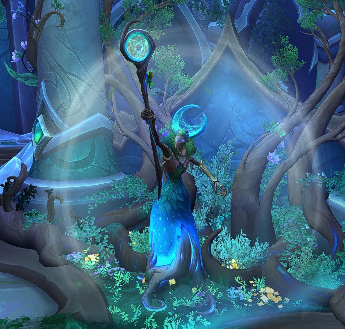
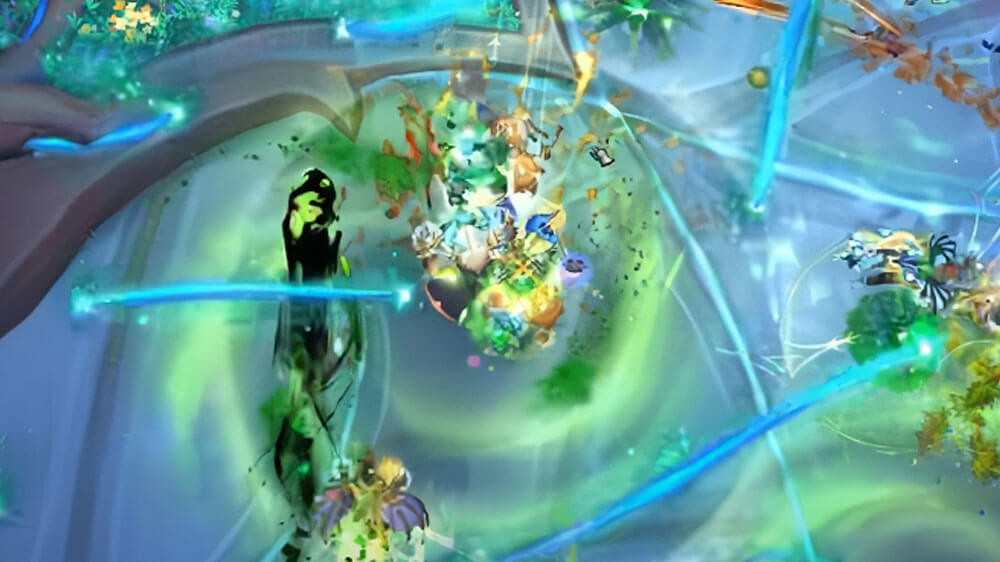
The combat part 3. I’ve only done the base level raid difficulty, but it just feels like a a wagon of chaos. There is so much going on, and very little is clear. I don’t know boss names, but there are so many that have matching colors for mechanics as the floor similar to a few of the dungeons. There’s a boss that looks like she’s part of a tree or a flower. The ground is green, and there are green swirls all over the place that you have to avoid. While there are dozens of players running around & abilities going off. That same boss has a teal line that falls from above that nearly blends into the floor that stuns you if you touch it. Extremely frustrating to get hit by mechanics you can’t really see. There is a boss with reddish floors and red swirls, etc… The game feels like it’s being hamstrung by immersion, or perhaps the people making the art don’t understand what they’re making it for? It just feels really disjointed from being a “game” first.
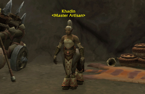
World layout is awesome to behold, but really confusing to navigate & learn. In Dragonflight there feels like there are at least half a dozen various vendors that are of critical importance to gear upgrades, or profession upgrades that are simply not shown on the map. There’s one guy that I found in a cave in the middle of the plains that seemed to be an important profession character that I’ve never been able to find again. The various “machines” that have gear upgrades or gear transfusions where you turn something into a set piece are also not on the map and are very difficult to find. Again, as a new player nothing in the game explained the importance of any of these things and trying to remember what they are, where they are, and what currency is needed was a bit overwhelming. It feels like, as a new player, you just stumble into things without having an explanation of just what you’re stumbling across, and what exactly it will do for you later on. I get that you probably want people out and about doing things - but from a gameplay perspective, having these kinds of “vendors/machines/upgrade terminals” all in a central location would be ideal. Or, at the very least, have them all noted on your in-game map so you know what is where.
There are so many collectibles that I feel like I have a lifetime of stuff ahead of me. It’s insane and I’m excited for it.
I appreciate everything you’ve crafted in the game, and look forward to what’s in the future. I just hope you’ve heard feedback similar to the above and might be taking measures to not repeat the visual issues.


