they have transformations that are all super confusing, i have no idea what the hive and lair look like and sometimes dont notice the cannon ontop of the command center. they are both visually confusing and ugly.
here is the planetary fortress
https ://imgur.com/a/DuFEhzY
Agreed, I don’t like the classic hatchery at all, and classic pf just looks silly.
Classic nexus looks slick tho.
I quite like it for my part, as it has really different mesh for once, and there is something… charmingly ugly to it, to reuse Togetic’s words. The kind of rusty and unrefined look that I like in steampunk artworks. I remember having checked if they were really that hard to differentiate, on one of your threads.
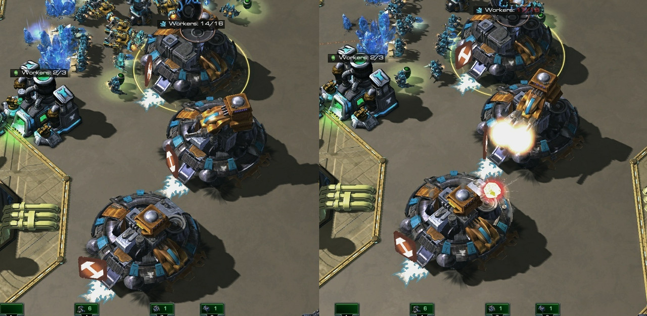
To me the classic PF’s ibiks cannons are quite visible. 
Blizzard should really just give players the option to turn off non-default skins on their side. It does make reading certain things more difficult when you see a skin you’ve never known about before in the heat of battle.
Classic hatch, cc, and nexus look great though imo.
But the classic skin PF just looks like trash, they should redesign it to look more in line with the sc2 default PF. Orbital looks fine though.
Honestly just about every other skin in the game pisses me off / makes it ugly, with the exception of the classic worker skins.
I agree with the PF but that’s the first and only skin I’ve ever seen them produce that was difficult to read.
i still cannot tell the lair and the hive apart. it feels like people using a skin have a competitive advantage which is a problem.
1 Like
I don’t get how one couldn’t tell the zerg hatchery, lair and hive. Come on, the Lair has a giant black spikes all over it, it has nothing in common to the hatch. And lair - say hello to this completely different structure with completely different colors that screams “I’m a Hive”
2 Likes
i can tell the hatch apart because i see it allot but the confusion is between the hatchery and hive.
What? The hive has completely different colors than the lair. Lair is with dark colors and the hive is like a clown with its bright colors. The difference is easier to be spotted than the actual SC2 skins.
1 Like
well thats the thing idk what either of them look like. i do know what a hatchery and a lair looks like however.
peek ma boi, you always comin up with someone new to … say. it’s amaze.
The only classic base skin that looks good is the nexus, It actually looks like there was some effort put into it while the command center and hatchery have very blurry textures. The command center isn’t too bad but the Hive looks like it was made by Fisher-Price.