Get ready for a customizable HUD and UI designed to be effective, attractive, and easily accessible.
That targeting thing sounds like an incoming nightmare but we will see!
With the UI changing with spec, please include an option to keep the UI the same for all specs. Pure DPS classes may not want it to change and redoing it 3 times per thing you change doesn’t sound fun.
Overall this looks good!
I am hoping there is a way to save UI layouts?
So far, I’m loving what I am seeing. Primal invasions, new targeting options, new interaction options, better HUD and even an editor. I’m digging it.
We need a way to hide and show the action bars with mouse over.
“And more updates to the art”
can you make a theme for each race/class if possible as optional HUD art?
Very nice changes. I wish they would have been implemented back during Wrath but this is significant progress.
I do wish that the minimap had a coordinates option.
Like the look of this so far. Can definitely see a few addons being deleted in DF!
Modern nameplates, please!
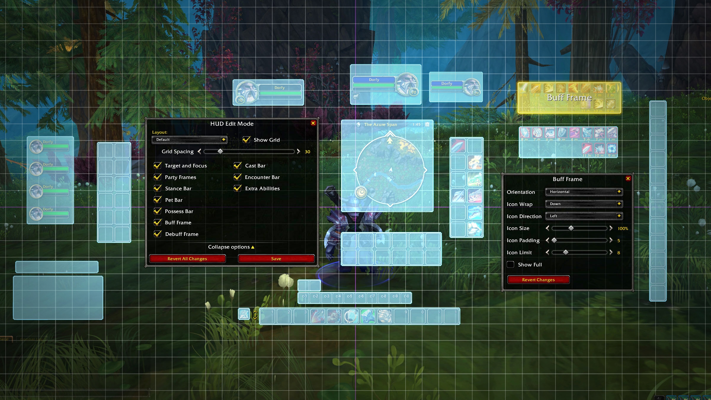
“With Edit mode, you will now have the ability to tweak, personalize, and move (almost) anything anywhere to your heart’s desire.”
What can we not move?
does anyone know if they will add a option to disable right click to target in this UI overhaul?
I’ve been really happy with the updates so far! The game really need a fresh look and I feel this is going in a good direction. Here is my wish list/suggestions for the UI, HUD, and general accessibility and Quality of life:
- Item level on any gear icon I have on character or in my bags, bank, etc. I find it much easier than having to hover on it to see the ilvl. I use the addon ItemLevelDisplay and would love for that to be baseline.
- Improved Bank UI. Similar to how bags are combined now, I’d like all my bank slots to combine into 1 big bag instead of multiple covering my whole screen.
- Easier to understand icons on minimap, especially for hunters, since NPC circles blend in with mining/herb nodes. I’d like the icons to be clearer for what is a node or NPC.
- Better UI for hunter stable. Similar to the bag update, it’d be nice to have all 20 pages as one instead of having to click through so many pages to find a pet. I’d also like better icons. Ideally, icons like their Unit frame could help me see exactly what each pet is. But that may be too complicated to look at. Improved Stable Frame is an addon that fixes the 20 page issue well.
- Customizable dropdown box. I’ve seen others suggest similar. Like the Call Pet or Mage’s Teleport spells, it would be cool to be able to make our own dropdown/collapsible box on the action bar for things like mounts/toys/etc. in stead of taking up tons of our action bar spaces that could be used for spells and such.
- Better reputation UI, especially for paragon rep. I don’t like how it’s hidden in the bag icon and not a new color of bar like many addons can do.
- Ways to see (at least) gold that my alts have. Rep would also be great.
- A better way to store and use things like hearthstones in stead of using bag space would be nice! A dropdown box could be used here.
- Minimap shapes.
- Minimap coordinates.
- Ability to show more than 3 currencies on our bag at the bottom, 3 is too little for me.
- UI updates for the spell book would be nice. I feel like some stuff gets cluttered in there. This is not as important, but having more organization especially after getting a bunch of stuff like pathfinder in there could be good.
- More action bars.
- Ways to hide action bars until you hover/mouseover them.
- More functions for Group finder to more easily show what roles you need and filter out what you don’t
- Blacklist of words, phrases, etc. for group finder. I’d like to more easily remove WTS and things like BOE farm groups from cluttering it up.
- Easy ways to have ALL of my UI and game settings the same across all characters and every specialization. I don’t change my UI between specs besides spells and would like easy consistency. If I decide to edit my UI I would like to easily be able to update it on my other characters as well. The Share function mentioned in this post may be a way to do this but I can’t test it.
- Updated character/enemy/nameplate frame. I assume this is ongoing. I’d like a fresh look because the old one looks very out of place now.
- Updated quest log for more visual clarity and organization.
- A higher quest limit from 25 would be good too.
- With the addition of the Interact Key (F) on the Dragonflight alpha, many players hope this function will be added to activities such as Fishing. Having to click a bobber that changes place each cast is hard for those with accessibility issues such as blindness, motor control issues, arm/hand pain, etc. Being able to Reel In the fishing bobber without clicking would be a very good addition to the game.
Edit:
- Updated Transmog frame. It is a bit small and cluttered, a visual update would be good!
Once you set everything set how you like it, you’ll be able to name, save, edit, copy, and share it with the community. And, for those that change specs often, the feature is designed to remember which specialization you’re in. As you switch between specs, the feature will remember the HUD layout you have for that spec and change accordingly.
Pulled from the article
I haven’t seen it mentioned anywhere, but have there been any changes to the max font size for the chat or for other UI elements?
Seconding this for ilvl overlay on gear icon, but I use oilvl (it also adds enchantments/socket status to character panel for self and inspection panels). Also this change to hide level equip requirement since bfa has been annoying just leave it in the tooltip even if max level. And I don’t even particularly care for levels anymore, but even I feel like it’s needed for low level alts and AH.
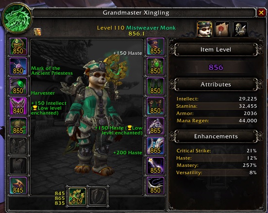
Here’s an example of oilvl (font and sizing is abit diff now):
Add more sets to the native set frame. Also allow us to toggle on/off removed items from wardrobe. Just for window shopping and/or to see how much we really have collected vs total mog ever made.
Oh wow looks like they took a note from FFXIV! That’s exactly how you move your UI around in FFXIV.
Please for all that is holy, add snapping.
Have a version of this go into LK Classic as an optional setting.
This would be a nice option ,we will see I already have these with pitbull and dominoes but i would like to see if this is better.


