Is there anyway to downsize the new professions windows? I don’t have a wide screen or anything, and i don’t want to end up downsizing my entire UI because that’ll just make everything else too hard to view.
Is there anyway to downsize it without messing with the rest of the UI or is there just no way to do it?
7 Likes
Gonna need it for the new profession update. There’s more that has to be displayed for Dragonflight.
A lot of the updated panels are comically large, like the talents.
2 Likes
even then, currently its way too large. it practically covers my entire screen. i’d at least like an option to downsize it really with how large it is
2 Likes
Download an addon to solve it 5 years ahead of blizz putting in a change.
3 Likes
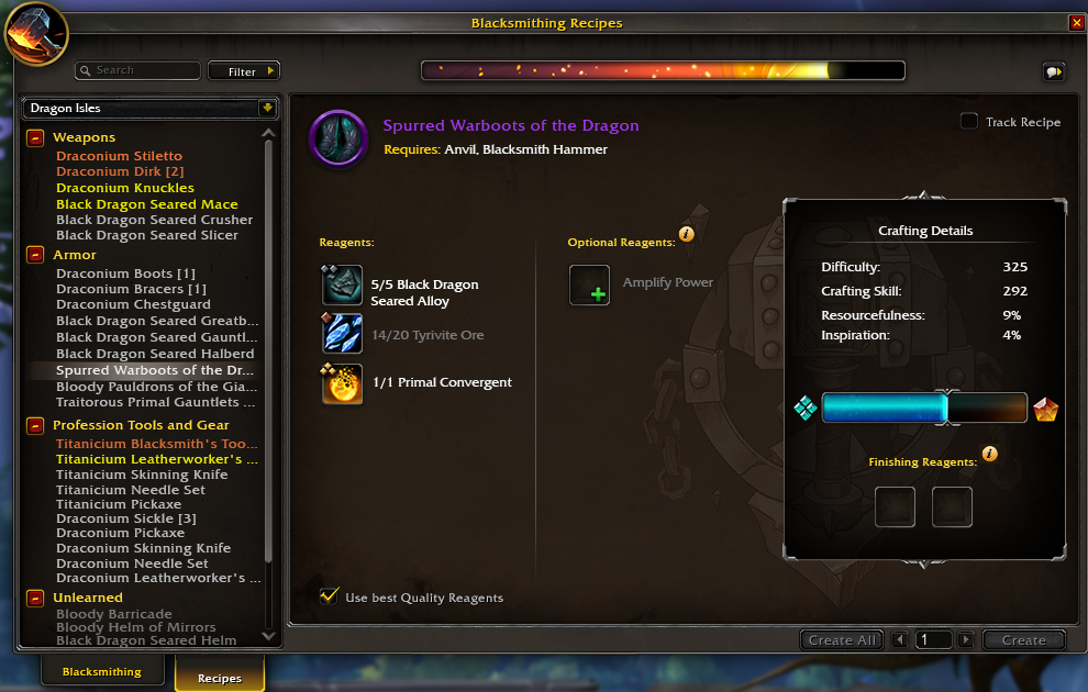
But even then… this still didn’t need so much wasted space:
5 Likes
what addons downsize the profession windows?
Move Anything used to, I think? Unfortunately, it’s not updated.
I honestly don’t know what others will do this.
rip. guess im just gonna have to suffer until addons get more updated… hopefully one that can resize professions windows will show up later down the line or something
None that I have cared to look so far, but people have voiced their complaints. Alot of addon devs didn’t even get beta until late or at all. So they are still working at things with only 8 days of time. Plus any work that some devs did don’t actually work as beta has different code vs ptr/live.
There are things that look perfectly fine on my larger monitor but overlap or block on my smaller one. If you have a progress bar in the middle of the screen it blocks an item you need to click. The overlap with the chat box and the action bars blocks the chat up and down button when I reduce the size of the game window (which I do often).
And for the love of god…
Remember the filter settings!!!
It’s so big it doesn’t work with other windows like the AH or achievements, and if you’re doing anything other than current content it’s constant close window, check something, open window, reset filters.
12 Likes
oh yeah, the new filter system sucks a LOT. i dont want to click over 4 times just to find the recipes i need. the bar is also a bit confusing in telling which recipes will give points and what doesnt but im sure ill adapt to that. hopefully…
3 Likes
You get used to it. Not sure it’s better though.
That space may be in there because they expect to need it in future patches.
That box on the right can be put smaller and or the bar going up and down instead of left to right!
There’s so many options to make it all smaller.
2 Likes
I’m still very disappointed in the DF Edit Options…
6 Likes
I’m disappointed in the fact that so many settings no longer seem to be persistent.
1 Like
Like part of me likes the new UI I like but some bits with the crafting screen is annoying.
In the beta I didn’t get to the crafting bit but in live it takes up a good chunk of space and there’s that little crafting window that I wish I could turn off!
2 Likes
I don’t like the new crafting menu at all. It’s too large, it’s more annoying to switch which expansion you’re looking at, and it’s harder to see all the unlearned recipes you need 
7 Likes