I feel disappointed with the Paladin S1 for the War Within expansion set, but I don’t feel like the artist should be replaced. I feel that other people might love it, and people have different tastes when it comes to aesthetics, and taste is a subjective matter. So. I feel that just because Paladin T1 isn’t exactly something I would like, I don’t feel the artist should be replaced or fired because I’m a rational person and not a karen.
washed out colors, ugly wings.
whoever made the set got in through nepotism
6 Likes
It’s one of those sets where I get what they were going for, but it’s just not hitting the mark. Actually I think it’s the colours that are the problem. They’re so very pastel. Like the blue and gold is not that bad at all. I will reserve final judgement for when we see it with the helm though. That icon for it looks interesting.
1 Like
it looks round when it should be like the antorus paladin helmet
I think the main gripe I have is that the wings jut out too much. I feel they’d probably look better if they were brought in a little and maybe angled down a bit, so the “peak” is about the same height as the head instead of being way above it.
2 Likes
I’m not a fan of the Paladin Season 1 tier set but I don’t care if the artist should or shouldn’t be replaced.
I was gonna mention something similar, I don’t think it’s too bad if the wings came from the centre back rather then the Shoulders and the fluorescent feathers longer like actual wings/feathers.
Need to see it with the helm, but currently the shoulder wings kill it for me.
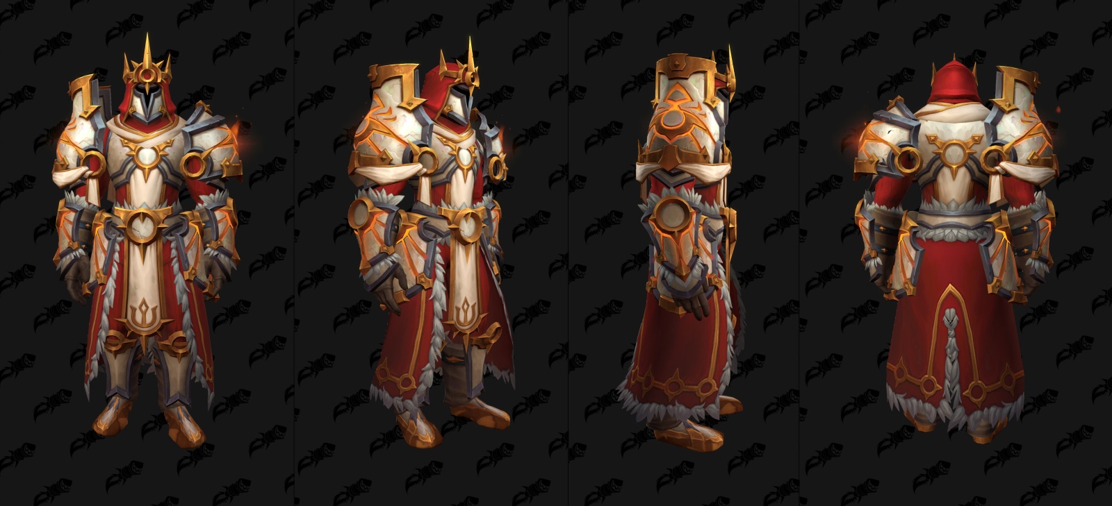
Colour wise I do like the red and gold versions.
But I think the Outdoor Arathor set looks amazing. I’m expecting every Pally to be grabbing this, I know I will be!.
6 Likes
I like the light blue and teal sets
1 Like
And I like you ![]()
They look too priestly, but then again their major cooldown is called wings.
These do deliver on that
The wings make the mog look like expletive.
Well played OP.
Too bad he doesn’t feel the same way about you
1 Like
Story of my life ![]() .
.
1 Like
I think it’s dope, especially if the helm is going to look like the icon suggests. DK set is trash tier though.
Who is calling for them to be fired? That’s childish. There’s nothing wrong with providing feedback they can potentially take into consideration and learn from.
The set looks decent, just dislike the pastel colors and the chicken wings. If they remade those into fuller, longer wings…it would be an instant win.
I think they are awesome.
And the only way they could be made better is if the lavender in the yellow set was replaced with a darker yellow and there was a PINK set!
2 Likes
or maybe someone just has different taste than you do
1 Like
It’s not an uncommon thing to see when people complain about stuff. But yeah, it is very childish. It’s not like the armor sets are the product of a single person with no approval or oversight.
2 Likes
the person making the set shouldnt have their taste prioritized then
and their taste is bland af
people generally enjoy bright colors and i know this for a fact. you throw away washed out clothing