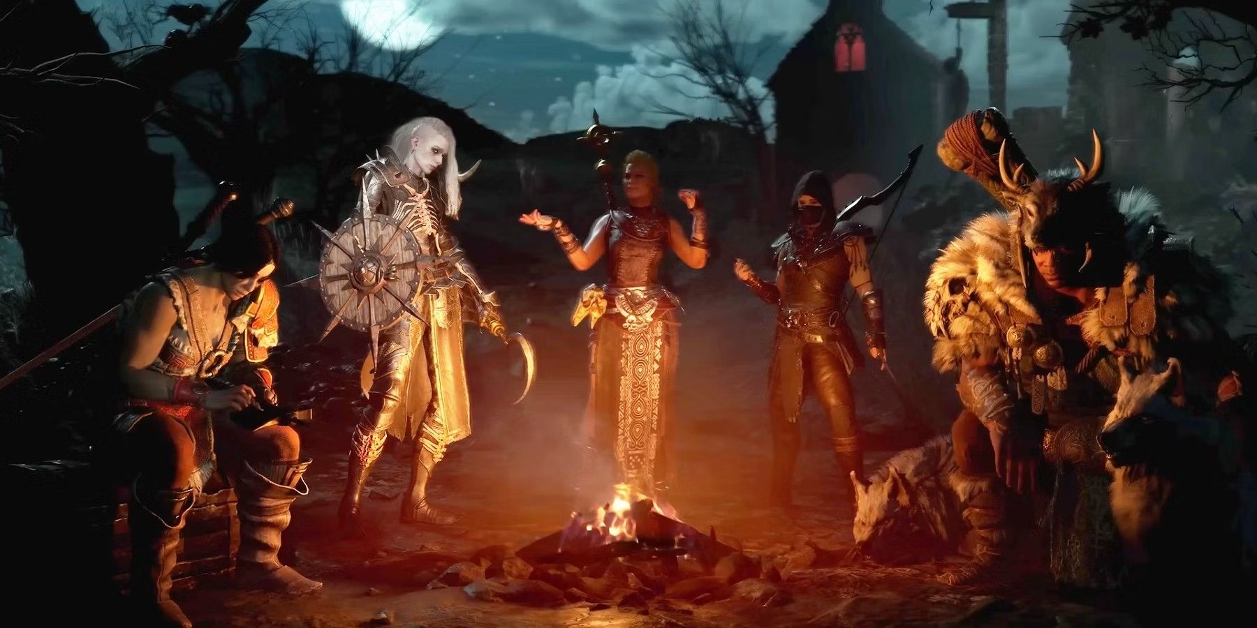
Anyone else think the new "character selection" screen is disorganized/ugly?

Title.

Very first thing I noticed last night is just how “messy” the character selection screen looked all of a sudden, it’s hard to ignore

In particular, the Addons button being “hidden” behind a new button was especially noticeable. Why not just leave it where it was (bottom left of the screen) for ease of access and convenience?? Such a dumb and unnecessary move (putting it behind a new “Menu” button) :man_facepalming:

I know it’s a minor thing, but I liked the old character selection/loadout screen better than… whatever this disorganized mess is
:face_with_spiral_eyes::face_with_spiral_eyes::face_with_spiral_eyes:

67 Likes

I lowkey hate it. I have around 40 characters on 5 different realms. It does not allow me to filter by realm.

53 Likes

It was nice to have them effectively grouped before, but I’d be happy if they didn’t make each one take up so much space when a text list would work fine.

4 Likes

Just arrange by realm what i did

2 Likes

It’s a minor thing that will take some getting used to. We’ve had the same character select screen for 20 years, hard not to get attached to that sort of thing.

4 Likes

Having all characters in a single scroll column is the problem.

Same way the new stables UI sucks, so does this. Except there’s no hope of addons fixing the character select screen because they can’t be loaded at that point.

13 Likes

Well, I really like putting my guys on a camping trip. Kind of wish they had multiples so I could put all of them in different camps.

The rest of it, eh. It is annoying that I have to reorganize everyone based on class and faction, but it isn’t the end of the world.

Extremely.

1 Like

I have around 25 characters give or take, it isn’t too bad.

With the full 50 I’d probably be going nuts though. It is a little unruly.

I’m an idiot and thought we’d be able to make a whole bunch of cool warbands for our characters. It would be much better that way. Not to say warbands are actually working right now anyway outside the loading screen lol.

This is what I thought we were going to have! I was going to make a warband of Vulpera named after my cats, and now I can’t fulfill my dream.

3 Likes

Anyone else think that there are too many threads on this one topic already?
This and switching flight modes…
:grimacing:

7 Likes

I kinda enjoy it, but I have like 4 characters that I play, between those 4, only two I would consider “mains”, so it doesn’t bother me as much, they sit neatly around the campfire, I imagine it is hell for people with more characters however.

It’ll take a little getting used to but it’s fine. I usually don’t play more than 2 or 3 toons at a time anyways. Organized em all by factions and i’m good to go. Lots of whiners on these forums lol

Yea, one the characters on my warband is blocked by a huge pop-up. Doesn’t look great.

1 Like

It looks terrible. I put Sagira along side Mailborn, and only Sagiras pet is showing, that ugly Fox model from MoP. Mailborns Bakkar doesnt even show. Its terrible.

1 Like
  • It is lacking categorization functionality. And no the search box doesn’t let you categorize things. Manually sorting the list isn’t categorization.
  • Filtering would be nice. I might want to hide my Horde characters for a period of time.
  • It is lacking realm information outside the tooltip which makes selecting characters with the same name more difficult.
  • You can’t search on realm either.
  • A compact mode for the list would be nice. Especially since it doesn’t really give any useful information, except name and faction, without hovering.

It isn’t actually ugly on my 2560 X 1440 screen though.

13 Likes

Searching by class is nice though help arrange by realm as well

You don’t like the new Diablo I mean World of Warcraft login screen?

9 Likes

I’m gonna drop my post from another thread in here for my thoughts on the new character select screen. Honestly, there’s enough issues with it where people need to keep making noise. Blizzard needs to do better.

We currently have all of our characters thrown out in front of us and then told we can’t use x service, y feature, or change z setting because the realm selection is incorrect.

Blizzard literally has an article out to explain how to manually change realms to be able to use character services. This is insane. They KNOW it doesn’t make sense. If they feel the need to have to explain their UI in a blog post, it should have never gone live.

They have multiple features that do NOT work cleanly with a consolidated character list, so why did they push it forward? Yes, everything technically works, but it’s wildly unintuitive (again, they have an article out to guide people, because it’s not intuitive and they KNOW it’s not intuitive).

Addon Settings:

This is still managed on a per-server basis. You have to manually choose your active server, change the settings, choose the next server, and so on. This doesn’t affect a ton of people as I’d imagine most people run with all of their addons enabled regardless of server, but I noticed it come up a few times last night and this morning when talking about the updated Character Select screen. The new screen implies it’s a global setting - but it is not.

Gear Update:

Similarly, this feature does not function unless you manually go in and change your realm to match the character you want to use the feature on, despite the character being listed right in front of you with a big colored “GEAR UPDATE” flag on it.

Character Services:

Much like Gear update, but worse, since these are paid services. These should be the MOST intuitive and they aren’t. If they have to put out on article explaining how to switch your active realm because the UI isn’t functioning in a way that handles this for you when selecting a character, there is an obvious design flaw.


Imgur

In addition to all of this, the new consolidated character list is HORRIBLE for general organizational purposes.

Many people, myself included, organize their characters by server for a reason. It’s SO much less cluttered to have, say, My Alliance on one realm, my Horde on another, and my Twinks on another.

This is by far the largest issue for me. I HATE my character select screen now. I spent hundreds of dollars on transfers to get it how I wanted it. Now everything is forced back together, which is what I spent money to fix.

If Blizzard want to have a singular global list, fine, but…

Fix the features that don't work with it, and give us organizational tools to replace the ones we've just had taken away.


If that means letting us make our own groups (ala favorites), awesome. If that just means sorting our characters by Realm with collapsible Realm Headers, that’s fine too. Just something to let us maintain the organization we USED to have. Moving characters up and down a massive list is not good enough.

I want to be very clear that “sort by realm” without collapsible headers is also not good enough. I paid something like $200 specifically to transfer several characters to another realm so I wouldn’t have them cluttering my normal endgame characters. They’re their own thing and I wanted them to be visually separated. Having them just clustered but not visually separated is not enough.

I really hope they do something. Warbands are great. Account Wide QoL is great. Favorites and the little Camp thing are… neat flavor, at least. That’s why I never posted about Warbands before. It all seemed totally fine.

Until I logged in last night and saw how they handled it.
They didn’t have to do this, but now that they have, they need to make it work.
Hopefully quickly.

24 Likes

Let us put all characters on the same screen

1 Like

I like it. Eventually we will be able to choose the background.