Yeah, I was there for that.
At least Anduin got updated to have a unique look. Alleria is going in the wrong direction. You’re supposed to go from generic NPC to unique look when you become important, not the other way around.
Yeah, I was there for that.
At least Anduin got updated to have a unique look. Alleria is going in the wrong direction. You’re supposed to go from generic NPC to unique look when you become important, not the other way around.
That is fair, yeah. They could, and probably should, give her a feature that we can still tell her apart with. Like her facial tattoo for example. Not sure why they removed it.
I’ve always assumed they were tattoos…but thinking about it now, I never remember hearing one way or the other. The game just describes them as “markings,” iirc.
If they are supposed to be tattoos, then it seems like a pretty big oversight that she’s missing hers. Would be relatively easy to fix, though. Unless they’re going to actually explain why it’s gone with some story reason.
Keep in mind that they changed Sylvanas’s face markings from the Night Elf-looking ones of her original model to the “running mascara” of later versions, too.
I’m guessing it’s war paint considering it changed from Warcraft 2 to Legion as well(though that could just be redesign after so many decades) but yeah, they really should have something given that’s like her most iconic feature.
I mean the war paint change was actually good in legion…covering half her face in paint…she just looked like a packers fan tbh.
Doesn’t sound like the tattoo is plot scarring removed, she just changed her appearance to visit Silvermoon after talking to Khadgar. ![]()
![]()
…which would imply she is wearing eyeliner. ![]()
![]()
I hate to say it, but her redesign is…forgettable.
There have been some phenomenal reworked models, Jaina, Tyrande come to mind. This one just feels uninspired, whereas her old model was the iconic version. I do not intend to dwell on it, but I am curious of the other renderings that were on the short list.
Well, that would make sense for them changing.
I just don’t think they should have.
I’m fine with her getting some new armor and doing her hair differently, but I think her “markings” should’ve stayed the same. It helped make her more easily identifiable at a glance.
She still has the stuff on her arms. Which was more distinctive from regular elves anyway.
This design was good.
Why did Blizzard feel the need to change it so drastically?
except that makes no sense since her original appearance is what elves wouild remember from warcraft 2 not this garbage. then again we have a lore historian who is from THAT school that thinks keeping consistant lore is for losers.
Personally, I dislike this artwork.
I don’t know if it’s the style or what, but it just makes her look… odd.
And don’t even get me started on Arator… Like his ears don’t even seem attached, as if they’re just sprouting from the top of his head.
uh…that’s how blood elves look in this game.
https://i.imgur.com/aOvyaV0.png
Like, that’s not the best artwork they’ve ever produced (I think Alleria’s expression is a bit strange), but this just seems like nitpicking.
As someone who plays a majority of blood elves, I would be offended by this if you weren’t a gnome. ![]()
I prefer both, because both of 'em represent a part of Alleria.
Her Ranger Captain and Windrunner past.
And now a more sleek armour that I think will probably accentuate her void aspects a whole lot more. Bit weird that there’s no purple but I guess when she can turn all of herself purple that’s probably enough purple.
Faction characters seem to be diving deeper into red and blue. Not too sure on hair changes. ![]()
![]()

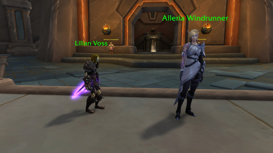
…speaking of updating designs, Voss is overdue. ![]()
![]()
Don’t worry, Arator is getting the half elf trim. ![]()
![]()

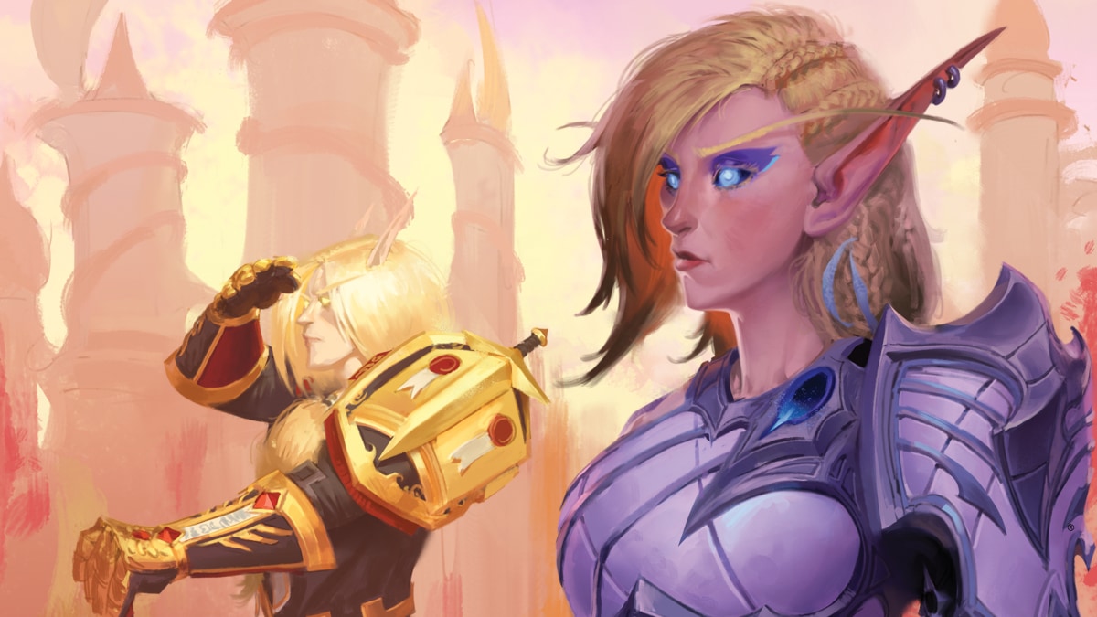
It’s not the artstyle per say, since Arator looks completely fine with the picture. I would even say that her armor and hair looks completely fine as well. (In fact Arator and Alleria’s armor are the two areas that look superb) The main problem is that the artist went with (or was forced to choose) a painting style that is completely unflattering to facial features that are in-focus of the viewer. The void gemstone on her armor is completely flat when it should be raised and rounded. So compared to the rest of the armor, it looks offputting. The eyeliner is very gaudy and painted in a way that it looks like she’s either a scene girl or a young teenager who is just learning to apply makeup by herself. (This isn’t the artists fault per say, as the character model also has problems with the gaudy eyeliner. Why the people making the decisions for Alleria’s redesign went with such a look is beyond me.) The cheeks, nose and ears are far too “rosy” and look more akin to someone who took the “tumblr nose” painting style to heart at a very early point in their art career.
arator is actually looking pretty good.
They made her look older. That’s good because she is old. ![]() could have kept her iconic look still but whatever.
could have kept her iconic look still but whatever.
she has been wearing the same gear for over a thousand years technically.