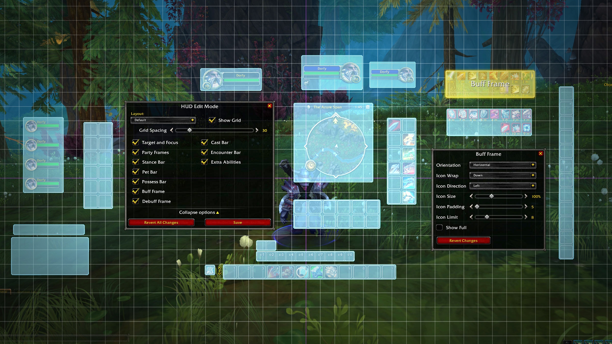
Get ready for a customizable HUD and UI designed to be effective, attractive, and easily accessible.
i’m confused as to why this was posted twice? looks nice though.
Here comes the Monkey’s Paw: You can’t remove that grid.
Bad Dan! Bad!
How do I flag OP for spam?
Feels odd to me that you are promoting this with pictures and all in an article on the website when in the picture you show the old player and target frames which are unfinished. Couldn’t this have waited until these were done? And why is it taking months to update those two specifically when the party ones are already updated?
Why is this double posted?
Can we have an option for Class colored player and target unit frames. I like to replace the green health bar color with the unique color of that class.
man this has me so oddly excited
You know in all this time I never noticed the Horde had gryphons as well. Nice that they are getting there own wvyren.
Thank goodness I can ditch a hunk of addons
Looks cleaner than most addons I’ve seen.
Will there be an option to set the colours of party frames’ health bars to match class colours?
It is beneficial to have it set that way for many obvious usability reasons (healing, PvP, ease of interaction and decision making, …).
