Scrolling through the appearances tab for vanilla-legion I see beautiful transmogs and sets, all things I would go back to farm on transmog runs.
BfA? I see slimy tentacles, seaweed, grubby eyes plastered onto armor with dull and uninspired colors. What happened? Why is the armor so ugly now?
44 Likes
Everything is subjective. BC era gear was the best looking IMO, with WoD looking much better than MoP. I haven’t cared for much in Legion or BfA.
I’ve wondered the same thing, OP 
8 Likes
I’m definitely a fan of TBC gear. Legion was ok. Didn’t care for WoD, MoP, Cata. So far I do love the seafaring looks of BfA. The N’zoth stuff is ok. I prefer the plate over all the others.
4 Likes
It’s like a worse version of what your wearing…
4 Likes
I think ditching the Superman 64-esque kryptonite fog is a huge plus.
1 Like
I like the plate set, and the boots for the leather. wtb faceless headpiece for leather, so I can look as cool as the plate wearers with a hat on.
Obviously the armor set designers were included in the lay offs.
28 Likes
Nah. The set I am wearing I made to be Demon-themed for my Destruction spec. With Fel Fire, golden armor and lots of horns.
“But you have tentacles!”
Well, some Demons have tentacles too.
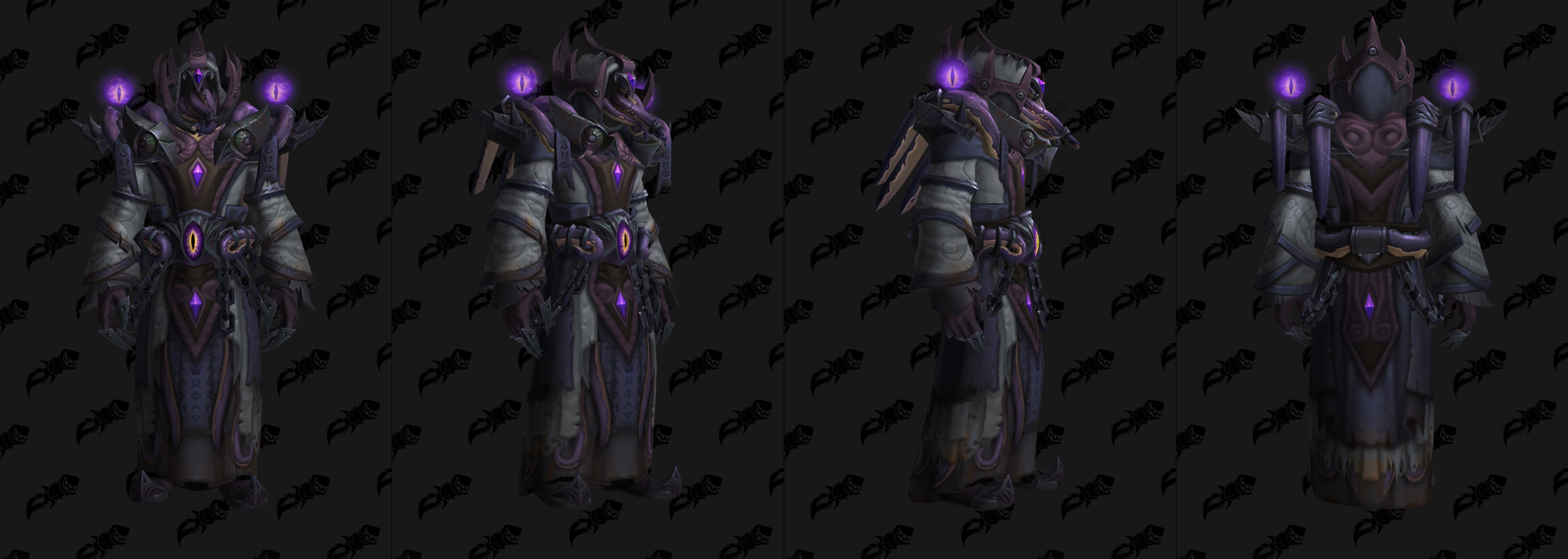
The Ny’alotha set would be perfect for my Affliction spec, as it’s Void Themed. Also: My character has a pretty complicated tie with the late Old God C’thun, and this set has C’thun purple eyes! (N’zoth’s eyes are orange)
I like the Plate and Cloth mogs this tier, mythic being the best in all cases. That said leather and mail in my opinion is absolute garbage this time around.
2 Likes
It is not the gear you wear, it’s how you wear it. Just look at me. See what I mean?
To appeal to srs raidrs, they started making raid sets very dark and emo. Everything is over-shadowed, like someone colored it and then someone else went over it with the Burn tool in photoshop. Horribly ugly, can’t even see what anything supposed to look like. Just a bunch of shadowed stripey noise running all over the garment.
2 Likes
Regardless of how good or bad the current sets are, it is a little bit of a bummer that the class sets were tabled for a bit
I mean, not for nothing, but DHs still only have one expansion’s worth of unique class sets…
7 Likes
Yes, the white and shining blue Mythic BoD sets were so very dark and emo.
Nah, bro.
We are literally fighting against the living shadow. Avatars of non-existence. The nothingness. The Void. The end.
Brightness has no place in this theme.
Once we move on to the next theme, there will be a place for bright colors.
Not talking about nzoth sets. I mean most raid sets since cata, as a whole. Look at sets from vanilla, where they were simple, colorful, and made you look like something.
1 Like
i gotta agree with OP here. i personally hate the entire lovecraftian aesthetic they got goin on this xpac. you either get dull browns and drab tones of grey and green, or you get tentacles.
there’s very little in the way of “subdued elegance” in any of the appearances:(
1 Like