Is it just me or do they keep using the same color schemes on repeat with our tiers?
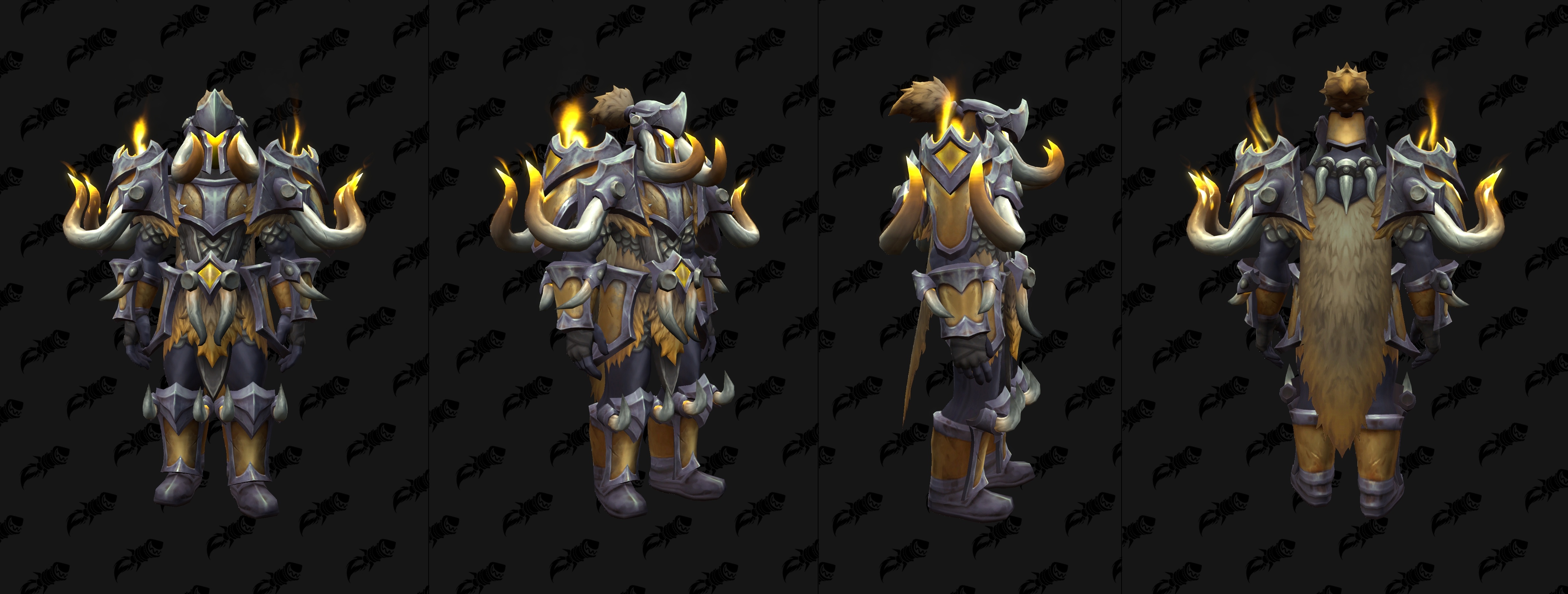
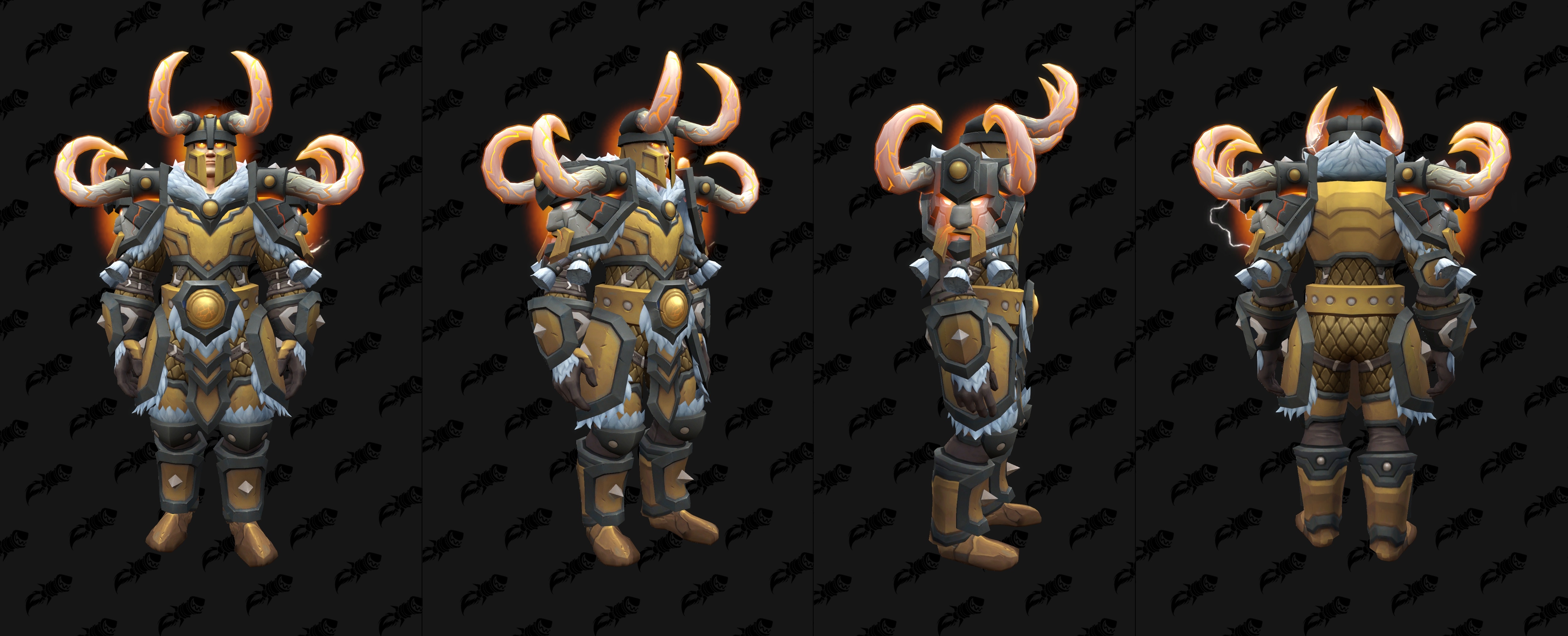
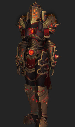
The gold looks just like TWW S1 elite but different model.
Is it just me or do they keep using the same color schemes on repeat with our tiers?
The gold looks just like TWW S1 elite but different model.
Variety is good, but frankly I wish they would use the same colors more consistently, since mixing and matching sets is often undermined by 7 different shades of red.
Oh god this does not look good.
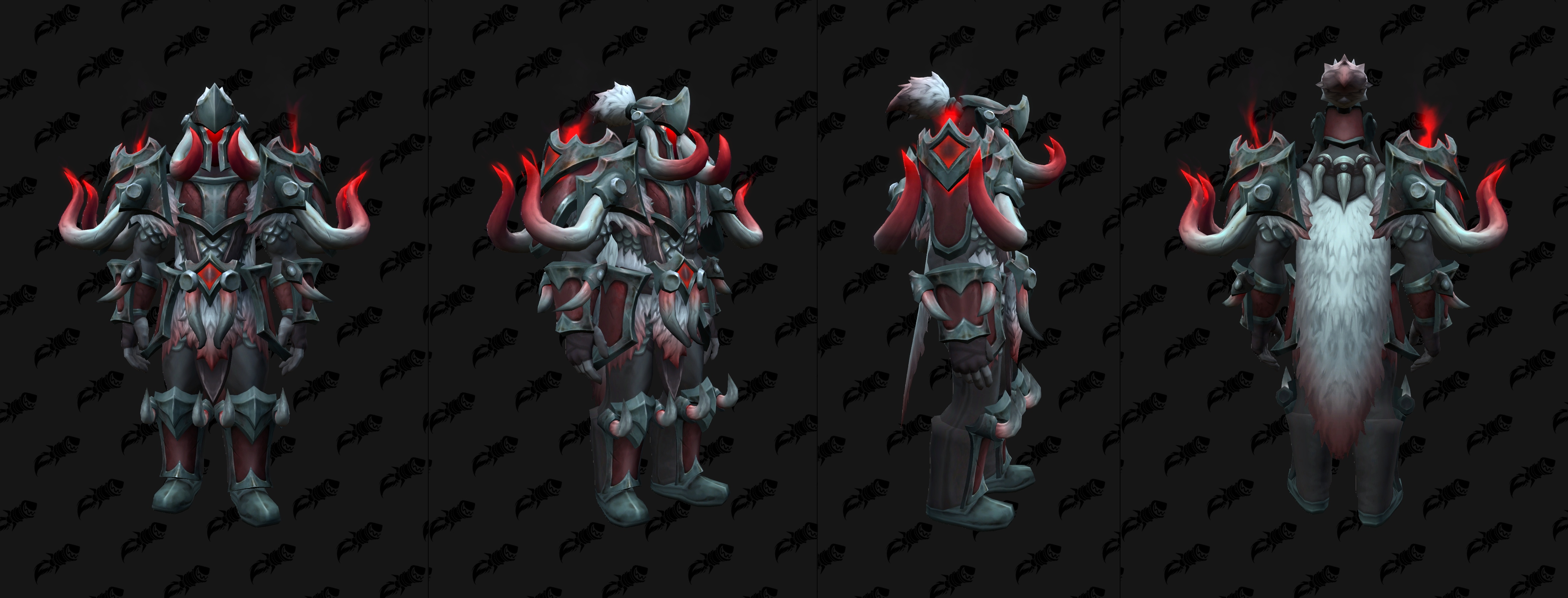
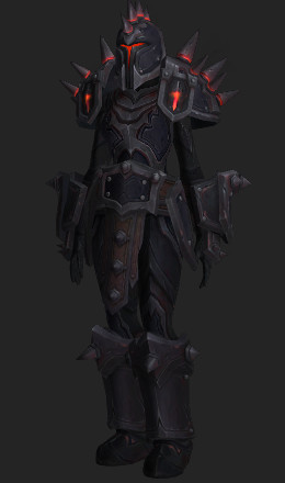
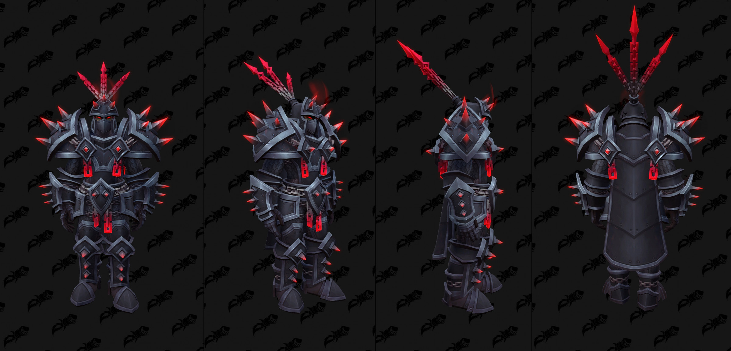
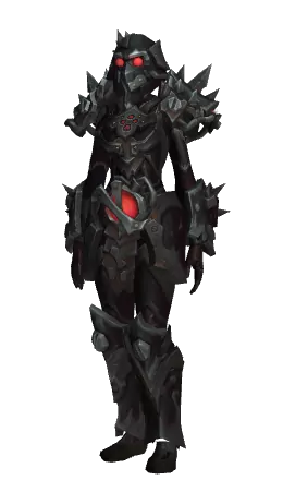
To me it’s a bit off putting when you see the current elite black/red (& the fierce/demonic elite) then see yet another black/red warrior set.
Then you see the tier gold set & see it’s the same color patterns as the tww elite lol with almost identical horns.
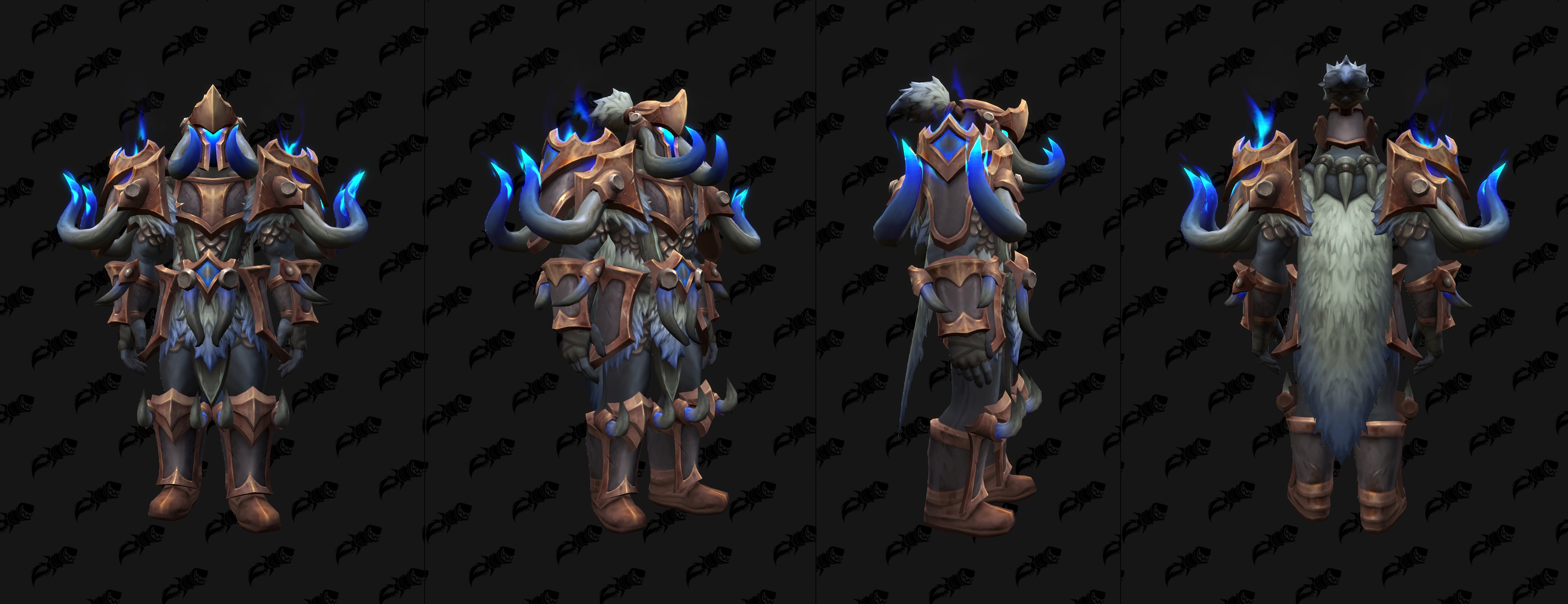
Where are the blues like my current set? Even tinting the current red elite to blue stands out

These sets just kinda blend in to me compared to some of the older ones.
Themes are themes for a reason. Variety is good, but there should be some tonal consistency… which is how you get a theme.
There literally is a blue variant of this new set. As stated, the problem isn’t the color, it’s continually using different shades of it.
You can have the themes without having repeat colorations lol quite frankly (& I never say this about the art team they’re usually on fire) it’s lazy & uninspired.
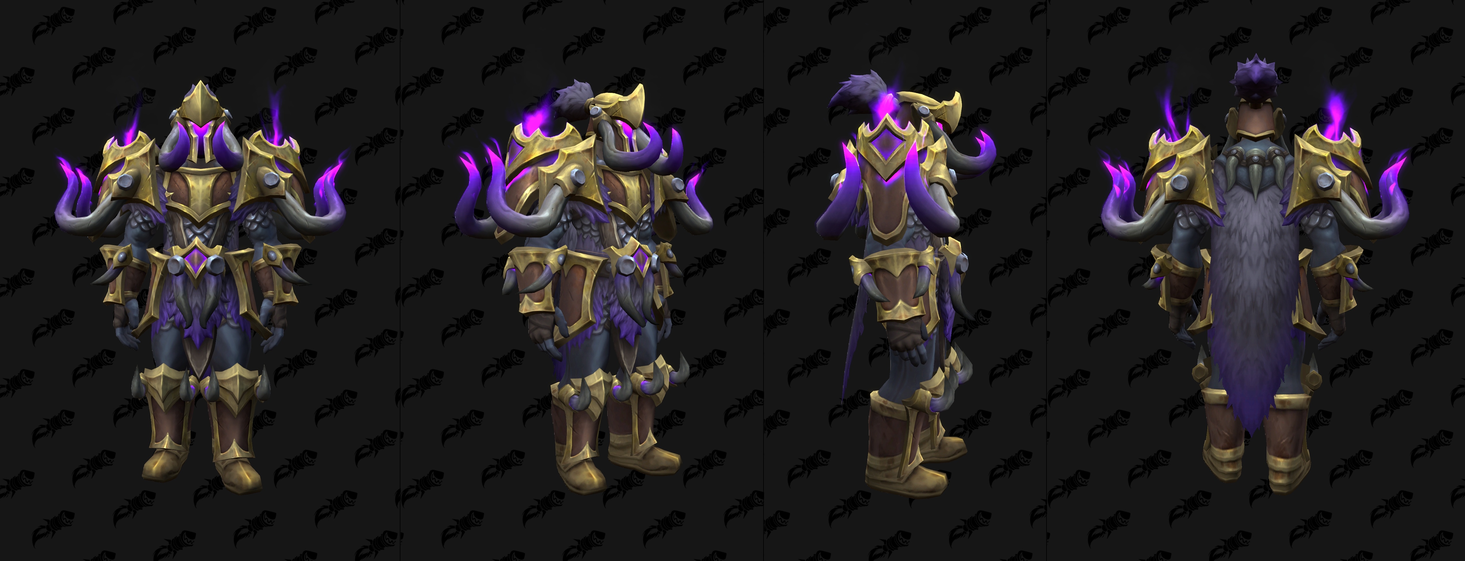
I mean look at that? WPvP set coloration is crazy similar.
I disagree, tonal consistency =! themes. I think it makes all the sets blend in… you should be able to distinguish the sets. They should ‘pop’ especially the elite & mythic sets.
Themes to me come down to actual design of the sets not tints or color tones. For example, demon hunter uses different demons for their tier; that’s a theme. Or in BfA the armor sets were themed off the raids.
Doesn’t mean make them the same colors on repeat imo.
I mean if you want to call that blue, sure lol; it’s mostly brown/tan with blue secondary.
It reminds me of draenic colorations.
Another tier set that looks like trash. Guess we can’t expect much more than a good looking tier more than once an expac.
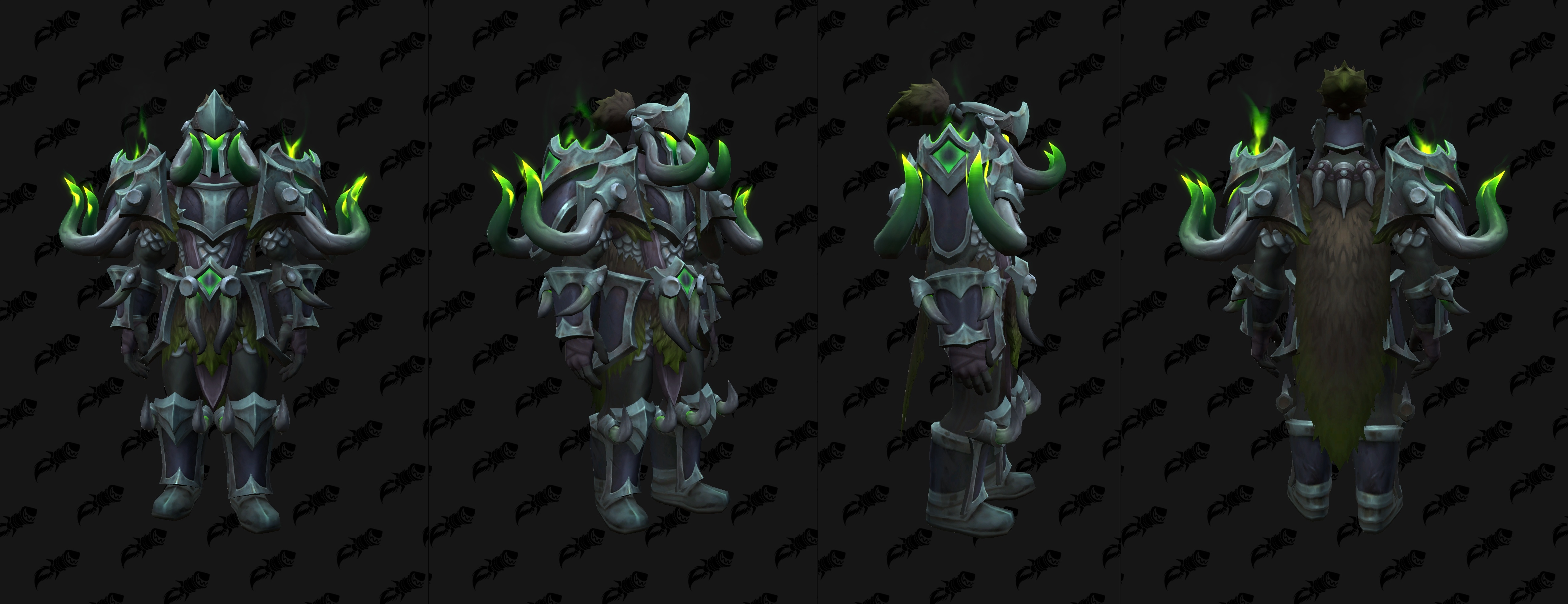
Elephant set is a bold choice lol. I don’t hate the idea but I think this is going to look really janky on most races. Definitely looks a bit too much like TWW S1.
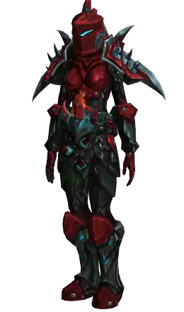
These are all pretty different looking sets (aside from the legion and current season shoulders) for all being black and red though.
This season’s has a lot more metallic silver accents.
The legion one is more matte with an earth toned black.
The Midnight set is more red and white / silver. I wouldn’t really call it black and red.
We get six recolors of every set that comes out. Color schemes are going to be repeated.
ngl I always thought this red set looks nasty.
Also it’s more black and red than the midnight set ![]()
That brown / gold / red legion set remains one of the best looking though. I liked TWW S2’s mythic pve set because it has a somewhat-similar brown and red color.
For sure, I’m just saying you don’t have to make the same color schemes for every other set
I mean this isn’t perfect but something like this where it pops & is distinguishable would be pretty cool compared to the gold color scheme that looks like tww s2 dk elite colors or corrupted gladiator’s plate set imo.


Lazy imo.
I dont mind colour schemes being repeated but damn i don’t see any hero talent fantasy looking at that armour and going yep that’s something i want to mog, let alone how badly muted the colours are and the weird glows they’ve added to it. Quite a disappointing tier set appearances wise after they’ve gone well for tww s1 and s2.

It does look quite a bit like TWW S1, but that set was a total banger. Especially with the lightning. Let’s hold judgement until we see it in game. The flavour effects/natty glow can change the variety from set to set quite a bit.
Those dull a muted colours will not differ ingame though…
Not wrong, but ideally we get a weapon to match and give the rest of the set some pop (eventhoughblizzbasicallyexclusivelymatchesweaponstoretpaladinsordksonlybutwecankeepdreaming)
I feel like so many times, the color schemes are the issue not much the sets themselves.
They don’t ‘pop’ enough.


This is AI garbage but regardless the color scheme pops wayyy more than the other ones they’ve created.
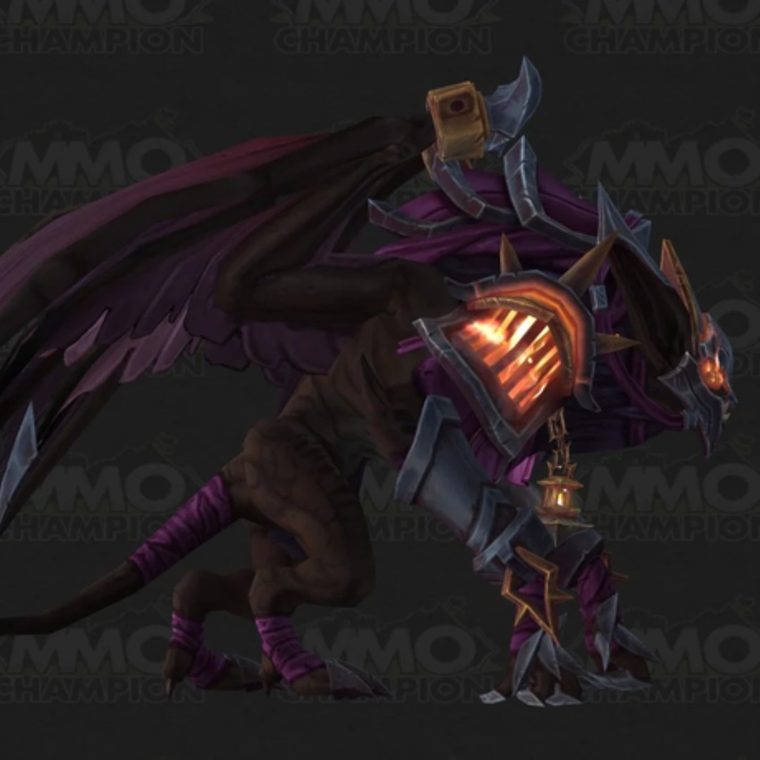
Another example is the Astral Gladiator’s Fel Bat color swap:
Old:
New:
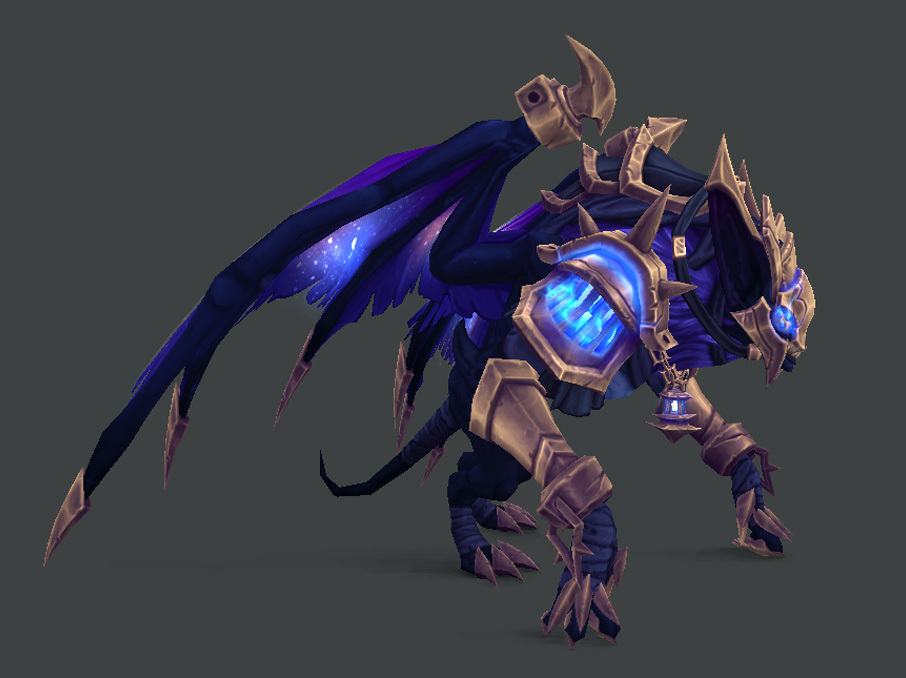
The mount went from super mid/bad to pretty good from the color change alone.
They need more metal colours (you can even go vibrant on the main portions see s2 df sets) with vibrant trims imo, those ai edits funnily make it look better but still a lame base.

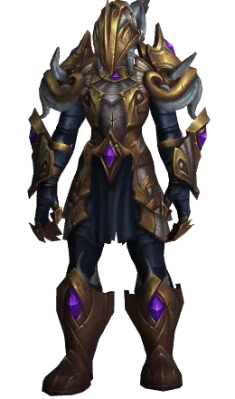
I love this set but the colors were a missed opp for somebody who loves blue.
Brother, im trying to have a good day here and you reply with something that could’ve been ![]() .
.