A login screen is the single most viewed artistic element in a given expansion, followed closely by primary city loading screens. When we AFK long enough it’s the ambient music and screen that takes up the screen space. Also, these screens are the exciting first glimpse of an expansion people see, it invites them into a whole new world.
Let’s take a look at all of the login screens throughout our history:
–
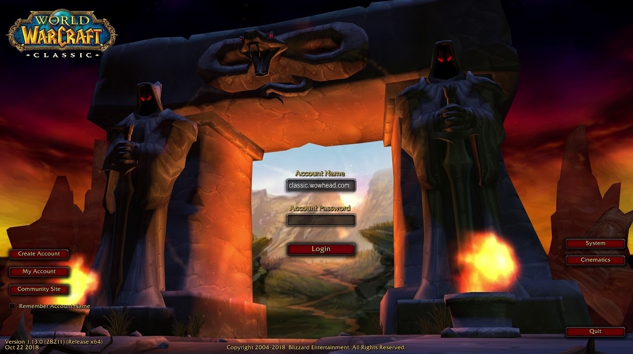
Original
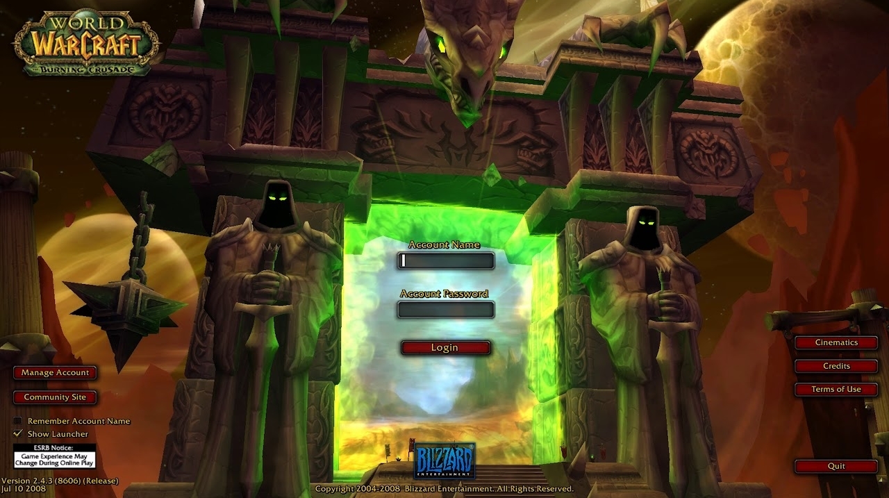
The Burning Crusade
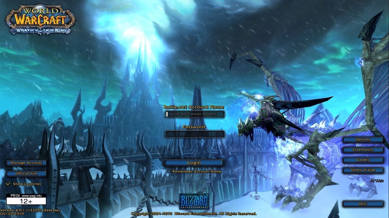
Wrath of the Litch King
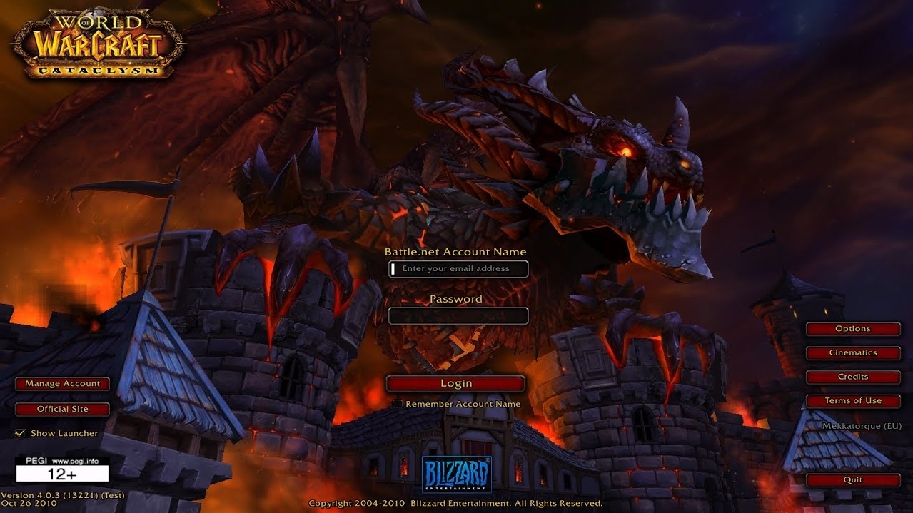
Cataclysm
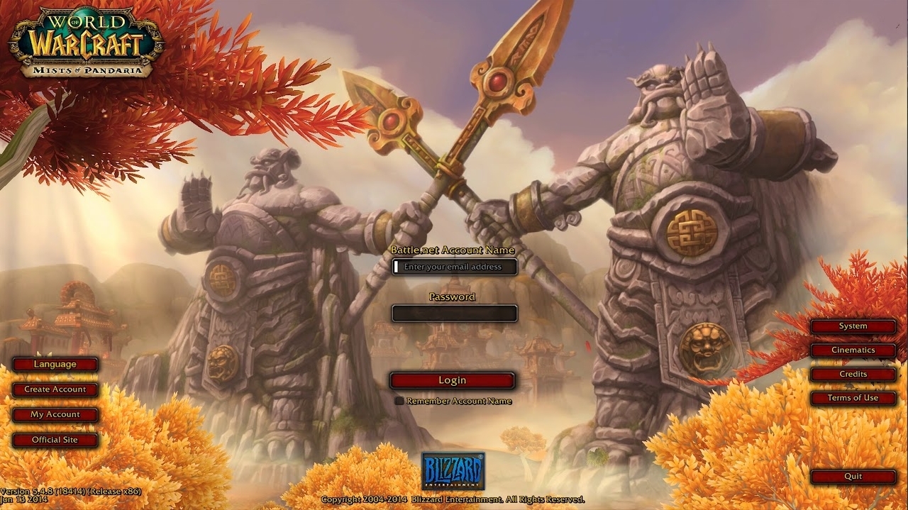
Mists of Pandaria
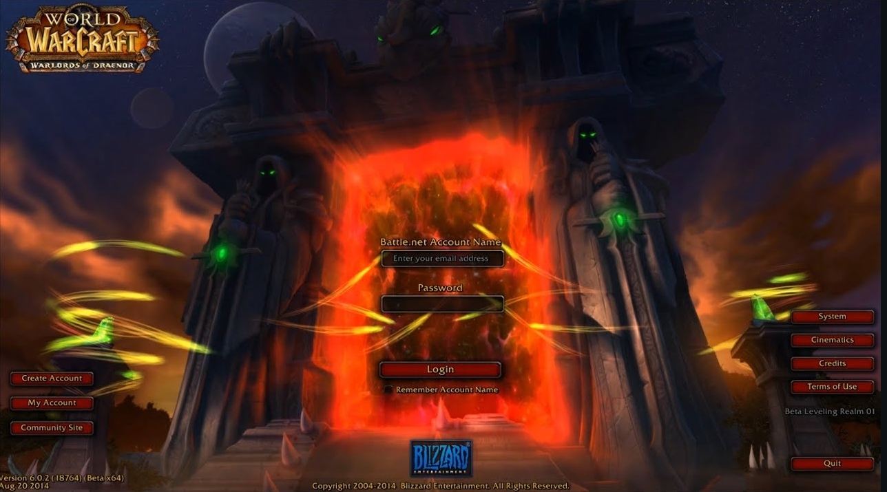
Warlords of Draenor
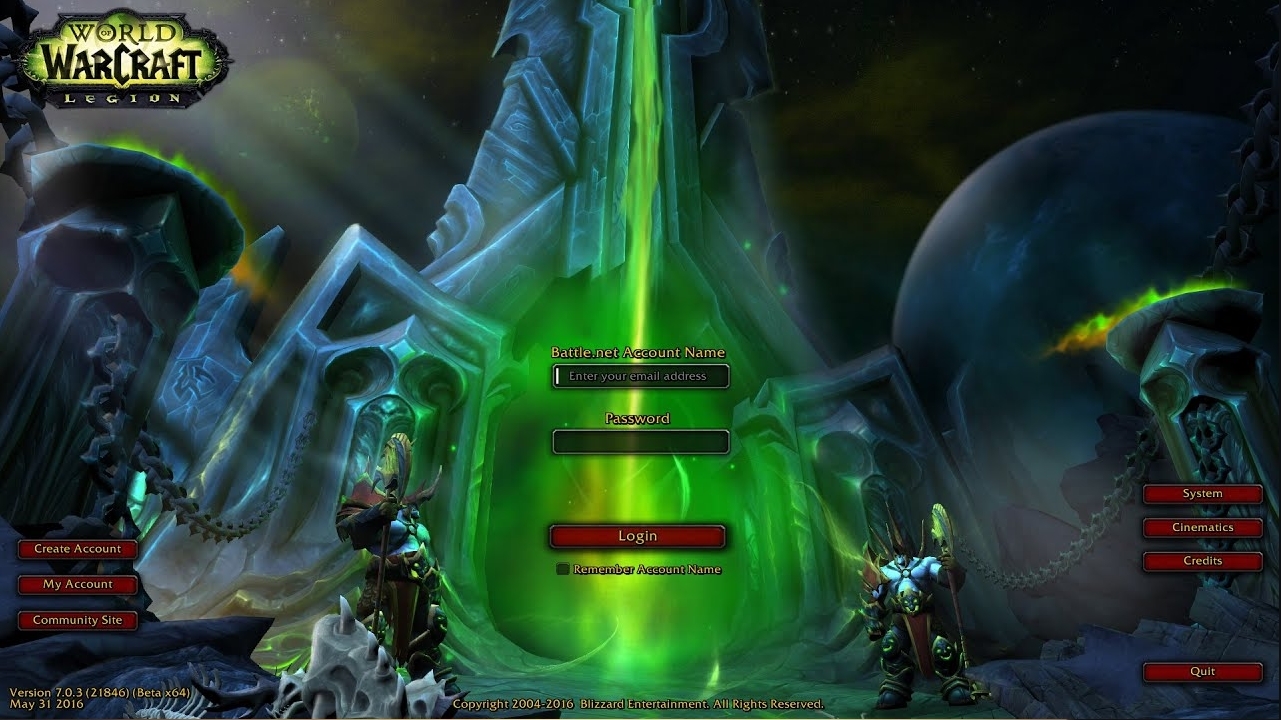
Legion
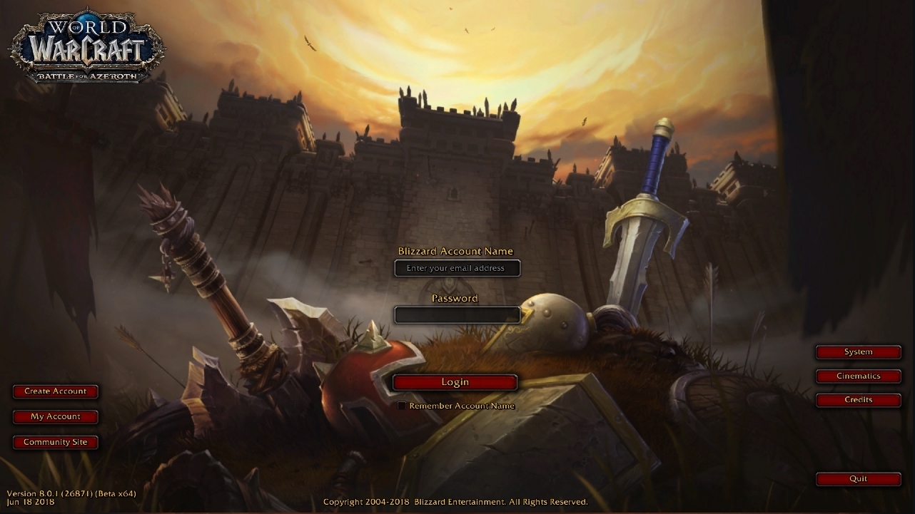
Battle for Azeroth
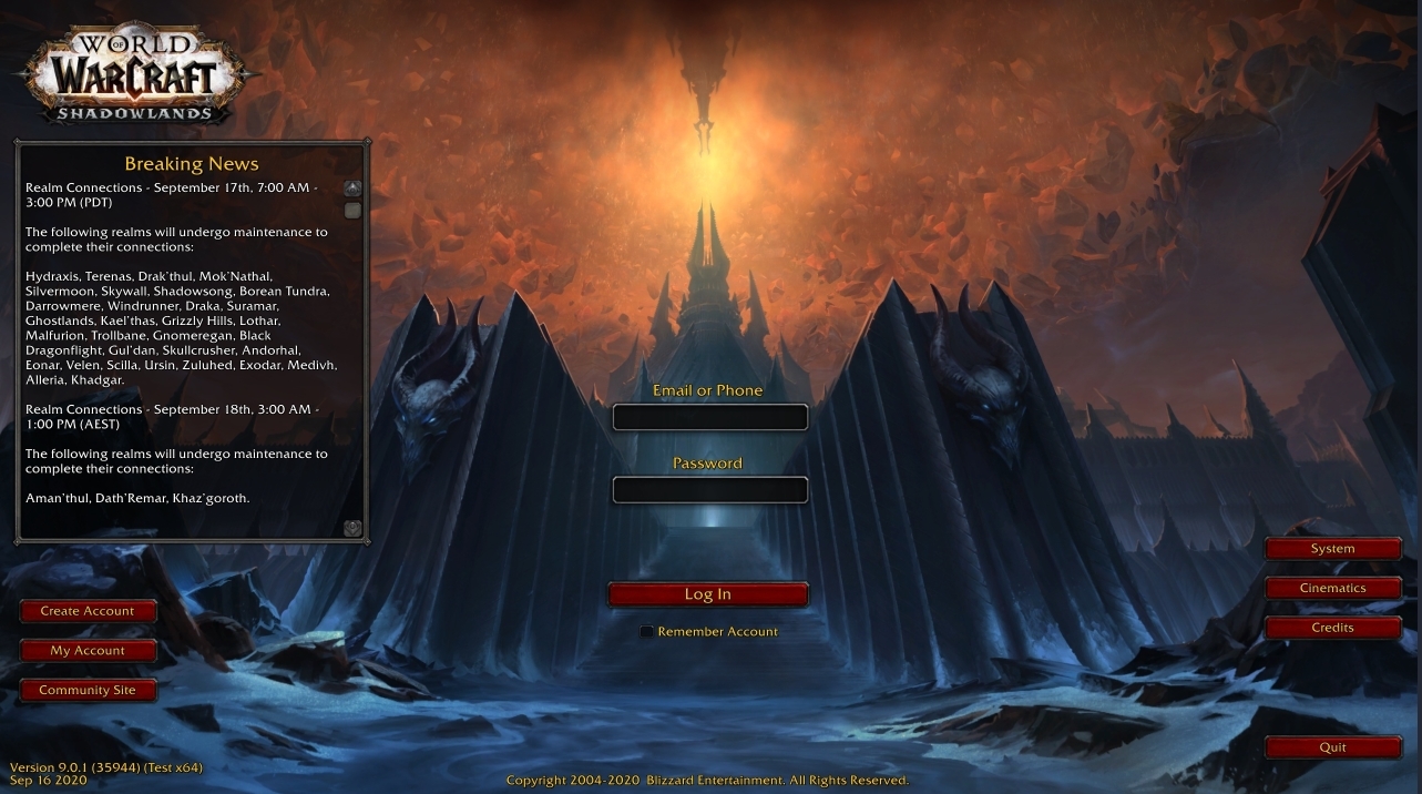
Shadowlands
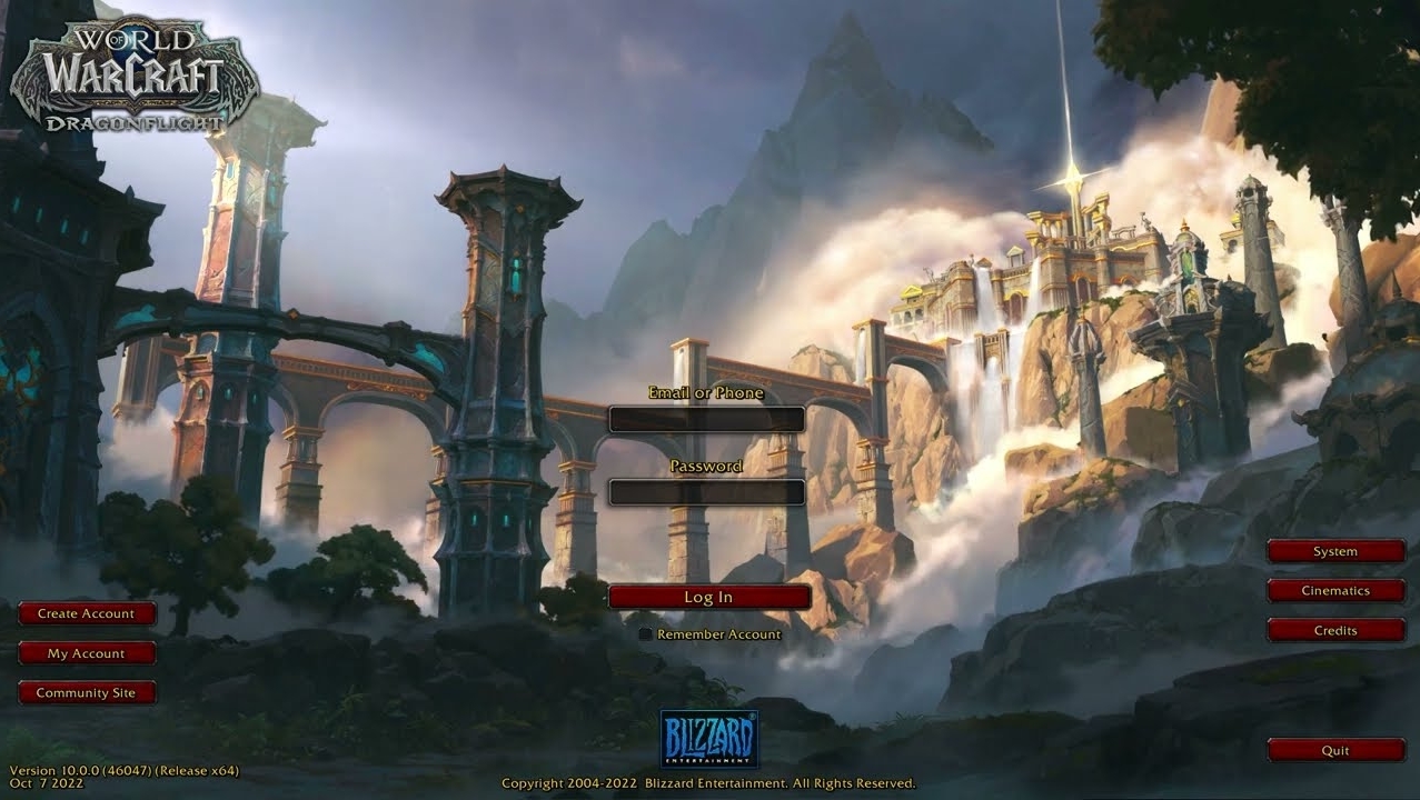
Dragonflight
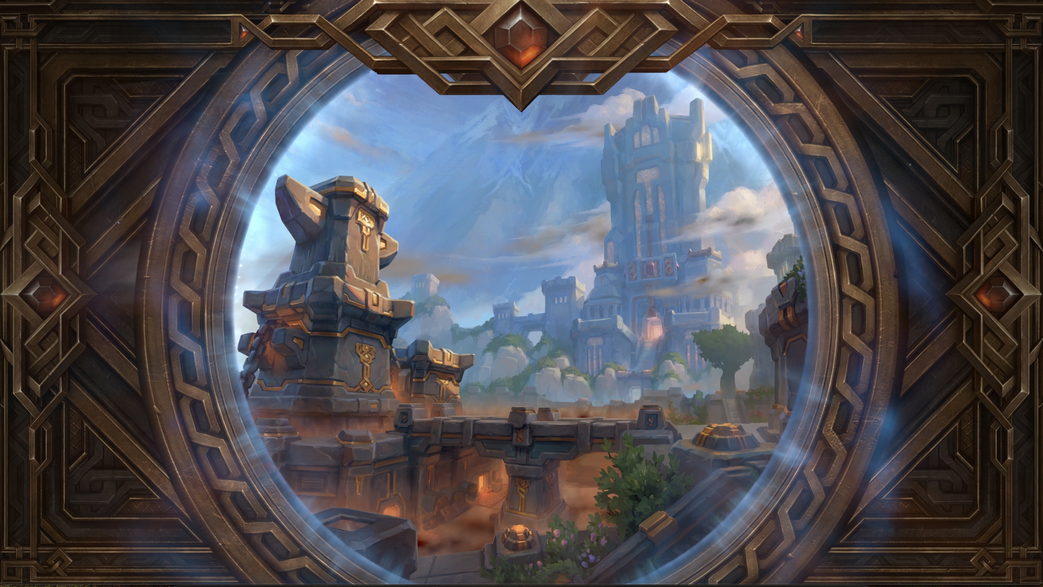
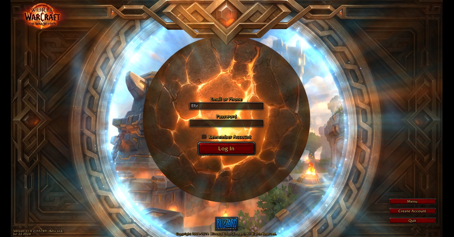
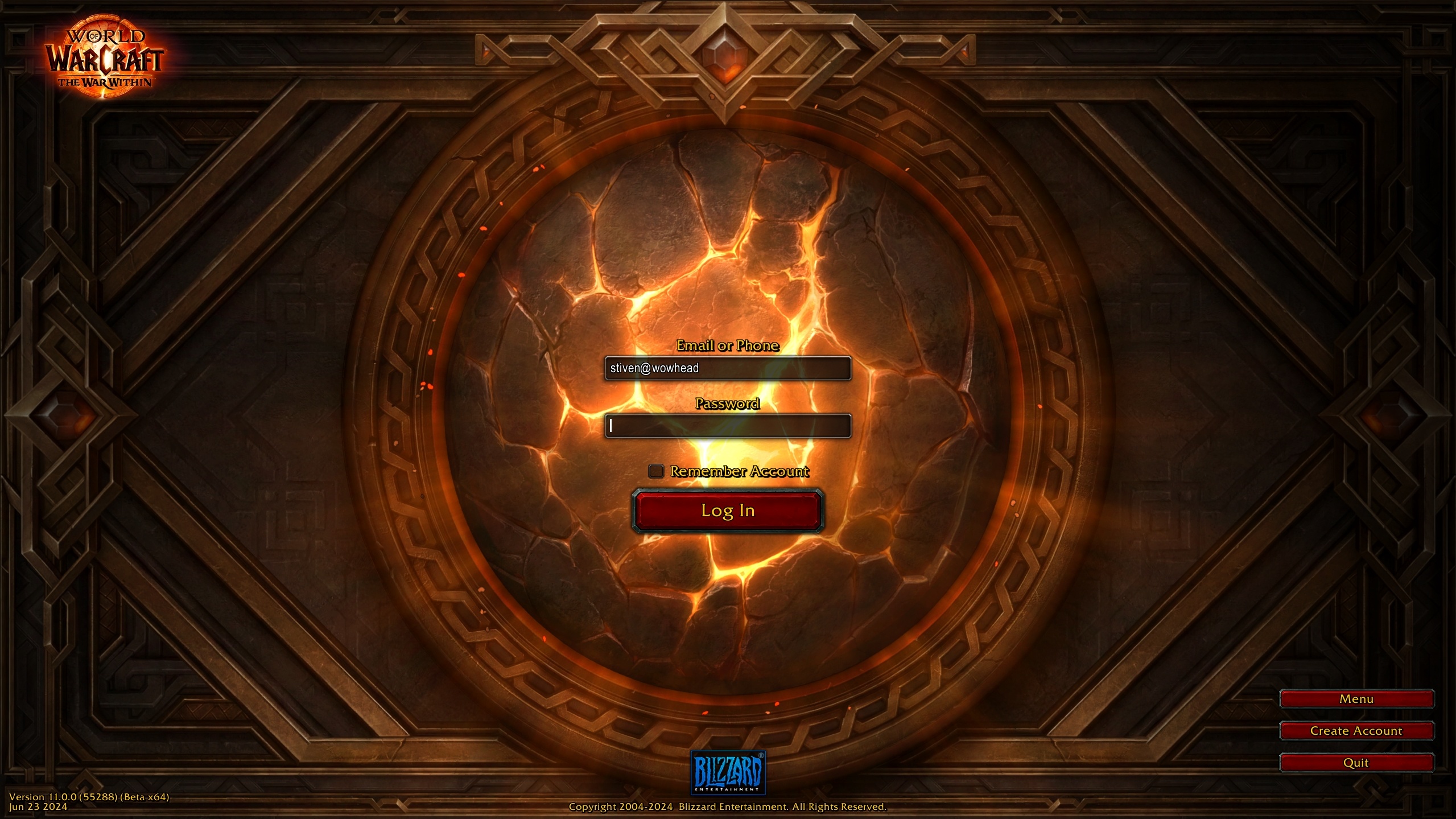
The War Within
Here are some themes that the proposed login screen diverts from previous login screens:
- Lack of landscape, much motion, or showing any structures or much fantasy.
- Background music (datamined) is taverny, poppy, and chipper, in contrast to the dull and gloomy login screen.
- The screen is dull and without much light - with the exception of having the light under the UI element. In previous login screens this brightness existed; it was almost as if our login was moving us forward into the landscape, portal, or to face Deathwing. But this one has us “moving forward” into a rock of some sort.
- The expansion logo seems much smaller (top left-hand corner) than the previous login screens.
- The red buttons - “login” and (presumably) future added buttons like “create and account” etc. all seemingly blend into the dark reddish/brown background. Even very sandy and dark login screens like Cataclysm or The Burning Crusade added lighter buildings or pillars to make these buttons pop out a bit more.
- It doesn’t really read like an expansion login screen, maybe more of a powerpoint title slide. This isn’t to say “Oh this looks so bad” - I’m sure the artists spend a ton of time on it and it does look good - but I’m just not sure if this is the right medium for it. I think as a loading screen element this wouldn’t be too bad.
Thanks for reading!
Oh wait, one last thing. What if we made it like this? –
Kidding of course! Happy holiday to friends and stuff okay bye ty.