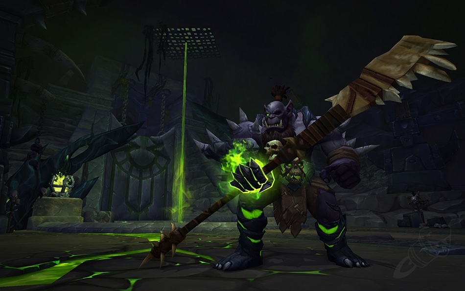
This is has got to be the best design so far. It’s giving… House of Hope Nurses from BG3.
edit: Also giving… SHIVARRAS!
This is has got to be the best design so far. It’s giving… House of Hope Nurses from BG3.
edit: Also giving… SHIVARRAS!
Not a fan of the head piece, but that appearance would probably look better in general as just cosmetics appearances.
Ooh that big eye is funky, I sometimes like when they have things that move around in the outfit.
Imagine Undead using it, though. Like imagine how cool it would look.
That’s true, the undead would look pretty cool in it.
Hmm not sure how i like it but once warfarin is out maybe ill like it.
Not bad.
I guess the eye part is an analogy to the Eye of Killrogg spell.
Topless, huh? Not sure I’m into that.
Shoulders and belt might save it. Also heavily dependent on if the robe bottom is leg gear or it’s part of the chest. If the latter that makes it less worth keeping it instead of just mogging over the whole thing.
you’re joking right? This is a joke.
It has to be one of the worst sets they have ever done. Why are Warlocks wearing a tower on their head
and those court jester shoes UGH
Love it!
Thats so shadow priest.
My only nitpick is it could’ve been themed better for the Eye of Kilrogg but I assume that would make a worse design. ![]()
![]()

We let the lock s1 tier set cook and they understood the assignment!
Off topic but what does cooking have to do with tier set?
Its nice but can we talk about the paladin tier?
Saw this awesome looking angelic holy warrior looking set… PRIEST. Turn around, paladins in a dress again SMFH
OMG, did you watch the animation?
It was already the creepiest thing I have seen in armor, but that made it exponentially more creepy.
Hats off to the dev team!
Ok, boomer
Looks amazing. I hope that red isn’t PvP rated.
Gotta wait and see how it looks on nelf and draenei.
There’s so many conquest gears that would never be within my grasp lol