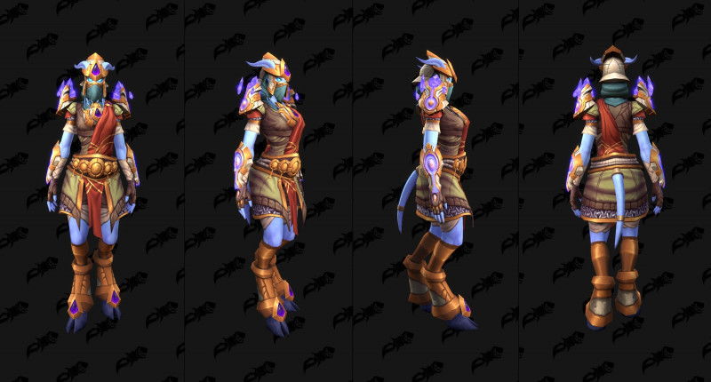
Tss the female model… they should have sticked to the concept art, really.
It’s just overcharged.
Honestly I’m really happy with this, and I didn’t expect to be. I’m going to have a ton of fun mixing and matching it.
I actually think it looks decent on the ladies. It’s just that big awkward thing on the chest that makes it look horrible. At least, imo.
I don’t main draenei but something does feel wrong. ![]()
![]()
At least the chest gem on the female model is less distracting. ![]()
![]()

I honestly wish the gem on the chest was more distracting lol
Draenei bodies were meant to be flaunted, why do you think the men have body builder proportions?
I guess i could see myself using some pieces of this if i was a rogue but idk. The shoulders and gloves have potential probably.
It’s like they went through my closet and went: “Yesssssssssssssssssssssssssss thiss will do!”
Wish the shoulders were bigger on female. I may use them but they look underwhelming atm. The hands and shoes are ok too.
Are they SERIOUSLY going to implement it with the horns clipping like that!?
It’s like they don’t even care anymore …
I Really dont like this head, and the floathing shoulders.
The coolest feauture of the Draenei are the horns, hair a jewel, This cover it all.
The Troll leaves a bit to be desired.
But man, this sucks. If I saw this in-game and had to guess it’s source I’d say WoD leveling greens.
it looks really good
Not mentioning that on the concept art, you have a sort of open jacket that is missing on this armor.
It would have made a lot of difference.
I mean, I’ll get it, because my main is a Draenei, but gosh I don’t like it.
The Troll set - awesome looking, but I did have to look really hard to make sure the “facemask” wasn’t actually a turkey wattle.
Yeah sorry. I don’t complain often but I’m disappointed. If an art person reads this thank you for your hard work, I do like that you’re taking inspiration from early Drenaei concepts.
It’s way too busy for me, and on the second set the colors clash. The early concept art had less crystals all over the place and were more minimalistic and gritty.
I like the minimalist helm in the concept art - it could just be a floating symbol or something, or a tiara.
I just wanted to mention as well, in the concept art the female Drenaei is wearing LESS and there is nothing wrong with this. Both of the models - male and female - should show more of the Drenaei physique. Minimalism for our spacegoat Jedi!
Hoping they improve it!
I like the rest of it all right but man…
That helmet is REGRETABLE.
It is indeed very underwhelming; looks like Blizzard was trying to fit too much into this set.
Looks fine, but I would always accept a shark with frickin laser beams on its head
