So, I actually have a bit of a criticism I want to make and while its not entirely a huge issue it is something I want to get off my chest and speak my mind on. Its something that I notice all the time in game honestly, grabbing my attention for a moment or two before I shrug it off and move on.
I feel that its hard to argue that the artists for World of Warcraft don’t do a good job because honestly they do a pretty stellar job! Its amazing to see how far the in game textures, models, ect have come for a game of this age and how well the game visually looks. More often than not when I see complaints on the forums they are rarely aimed at the art team, with the exception of the major model reworks and such. For the most part, even for BFA, whenever artwork is brought up its usually spoken pretty favorably of. I have seen many posts of people who have down right bashed everything about the expansion but still say that the art team does good work. (No one ever comments on the sound team, poor sound team.)
Personally, my opinion is that the game visually looks rather fantastic for its age and I am always amazed with how good everything looks visually… except… Well, I feel like Blizzard has kinda drifted into a bit of a pit in terms of color and contrast, which as mentioned I notice frequently and then just move on. Today, however, a certain tweet really put into perspective what I mean with a single picture. (Well, technically two but I merged them into a side by side comparison for ease)

*Tweet in Question – https://twitter.com/vephriel/status/1128374728761036800
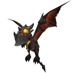
This is a side by side comparison of the “Nefarian” pet for the 15th anniversary event alongside “Nefarian” proper. It immediately caught my eye just how drastically different the color/contrast is between these two images.
While the left image has an absolutely fantastic looking model it also looks like someone left baby “Nefarian” out in the sun for a few years and all the color has just become faded. What happened to the sharp colors, the deep and rich black scales, ect?
Even “lil Deathwing” by comparison to the new Nefarian pet is far darker in shade but even then its more of a dark grey vs a washed out pinkish red.
It’s a trend that I honestly do not understand in a lot of the more modern in game artwork. A lot of it feels very washed out as if the contrast has been lowered and I feel like its something that really started happening more and more since the end of Cata and especially MoP.
Imagine if some of the extremely vibrant older armor sets had that look today. That washed out, brownish, dusty, dulled look compared to how sharp and deep they were. Using Paladin Tier 2, one of the most iconic Tier sets in WoW to the point of much being a keystone representation of “Paladin” in much of Blizzard’s promotional artwork over the years, what if it was as washed out and dull?

Imagine if Tier 2 looked like that, lowered contrast and a dry, dirty, brown tone. Just looking at the Nefarian pet feels like he needs to be ran through the wash maybe.
It honestly reminds me of a lot of the early PS3 and XBox 360 era games where everything had this overly brown tone/tint and bloom effects were used wherever and whenever developers could as if they were ashamed of using rich and vibrant colors as well as deep blacks and bright whites. It seriously use to be a pretty big point of contention in games journalism because of how often games did it.
If someone were to show me the Nefarian pet and ask me what it was, and I had no idea what Nefarian was, I really do not think that “Black Dragon” would be near the top of my responses. Black Dragon is not even remotely close to the first thing I think when I see it.
Even comparing the Deathwing Mount to the Deathwing of Cata you can see how vastly different the tones are.

The new Deathwing looks so incredibly bright and light grey, his Elementium Plating looks more like Iron Plating. Again, its not that the new models look bad or that the texture work is bad but it just feels like there is a major fear to use richer, deeper, colors for some reason and I can not grasp it.
At least with Deathwing I can clearly state “Yep, that’s a Black Dragon” if someone were to ask me what he was, but I would be much more aligned to saying that Nefarian is a Dust Coated Red Dragon or even Brown Dragon (Not going to go too deep into the lore side of things, I know an argument can be made on the whole Brown Dragon thing but Nefarian is suppose to be a Black Dragon)
I am not trying to give the art team a hard time because, honestly, I love the quality of the artwork we have gotten over the years. They do a pretty stellar job considering all things and I truly appreciate the work that is done. With that said though, I honestly wish we could get some more rich and vibrant colors. To actually have more deep blacks, bright whites, rich and vibrant colors. I am not saying there should never be dulled colors in the game, I just feel like its far more common place now.
Honestly, its just a criticism I have. I know that there are “more important” issues with the game in the here and now but this was something I really wanted to get off my chest and make a comment on. Something that constantly nags me but I brush it off after a moment. Seeing the comparison tweet today though really made it jump out that much more however and I felt it needed to be said.
Love the art team, love the work they do, would really love to see real, deep, blacks again though for “Black Dragons”
