Based on what I see from these vids below and so far
Graphics
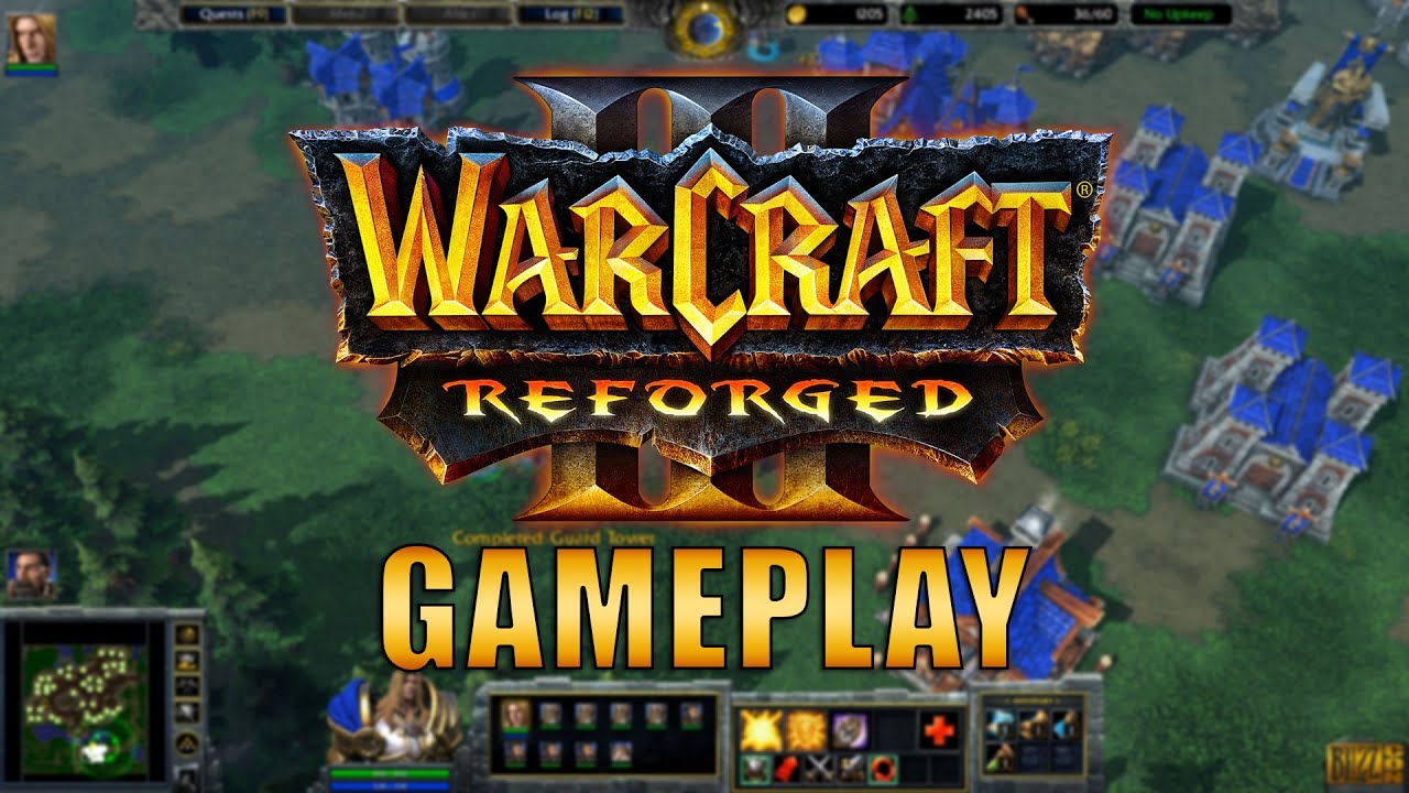
In this comparison new graphics look better. You can see the details in the dirt, the needles in the trees. Models are all good I think, the way they have been seen leaked lately. Water looks as realistic as in SC2, what better way to make water, the technology to make it was good, unlike old war3 - blue water…
BUT
The Colors
So while the models and texture details look better in the recent update (beta), it seems they decided to bring back colors that are closer to the old war3.
It is done for readability but I would beg to differ when some say there’s an issue:
As someone who has been 1v1-ing war3 for many years before SC2 came out, then for several years SC2, in SC2 we get used to playing with the pale (desaturated or dark themed colors), the mechanics of units dying faster, more units clumped, skins with Warchests - do you guys see any pro player or GM streamer complaining that they lose because of any of that?
Sure some don’t like skins but it isn’t so hard to learn the units and distinguish, as ALL play like that on ladder?
So, the war3 Blizzcon 2018 demo showed these graphics, worse textures (thats why we say now textures are better) but more realistic look with such colors, one that IMO makes the game feel much more like a new Warcraft.
While now we have that
Like is anyone thinking that colors like video 1 are hard to read units with? Not everyone wants these bright cartoony graphics. People want to feel they pay for something fresh not resembling the old graphics.
A possible solution
http://i.imgur.com/kGbgwAV.jpg
SC2 had a Team Color Intensity, why not use it for more readability? e.g Human vs Human. There’s no need to kill the good details just to make units easier to see. You can use these tools.
Or Game Saturation - where someone can make these new graphics look more desaturated like in 2018 Demo.
I don’t think that a single person playing War3 (even if pro) entirely not looking into a lot of SC2 features should decide entirely how things should be, and using the readability as a reason.
BNET features
REPLAYS
I think you are already on it. Ability to rewind replays more like in SC2 style, ability to end game into replay would be good.
Production Tab/ Heroes + their skills + items/ Upgrades, APM, all that Replay parsers (3rd party) can do now, im surprised such info isn’t on some menus in a Replay.
many other ways you see a player’s camera and first person view, like in SC2
Do not pause game on replays even if game is in windowed mode and the window is not the one on front (a small problem but a needed one I think, I need that at least).
LEAGUES
I find the SC2’s battle net system of Ranks being divided into league tiers better than just levels and an icon next to that. Games not only in sci-fi but fantasy like Dota/LoL use similar league systems. It gives more interesting depth to what you are leveling with continuous laddering.
ACCOUNTS
Ability to not have your account deleted/reset after (3) months of inactivity (or whatever it is)
Less smurf accounts? Some restriction on that?
SOCIAL
More interaction with channels profiles CROSS-GAME communication, maybe it’s done already and I do not mean more facebook or anything like that… should stay as social media not game panel.
REWARDS
War3 does better than SC2 - animated Portraits! Perhaps more opportunities for earned portraits, perhaps a LOGO/DECAL?
im not fan of Achievements so I won’t offer anything with them
OTHER GAME REWARDS FOR SPOILS OF WAR
Waiting for SC2 portraits and such, want to show our true game of origin that war3 is in other games as well

