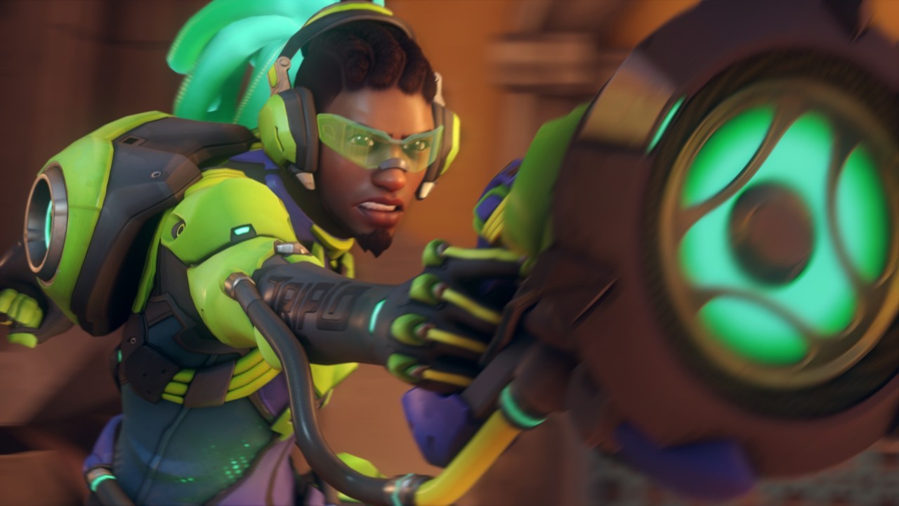
You massacared him with that new design. All of the heroes look refined and better but Lucio looks like an alien Blizzard plz change it.
He looks cool to me.
I’m not digging it either.
He looks like he was the DJ of a rave party.
I mean…he kinda is?
I can see how his look meshes with the style of music from his CD
And in Rio you can see his DJ stage in a nightclub
But for me, i really love all of the small details in his outfit and how they re textured his face and hair
Your opinion is wrong.
But they are transferring your skins over so the vanilla doesn’t matter. I haven’t used his base skin since May 2016.
Thank god.
He dies in the Blizzcon sample game so does it really matter?
I like his new deisgn. His hair changes color when you switch between speed and healing.
It’s fun!
aside from the pool noodles that are his hair i think he looks pretty great!
Ugh… his slimey looking, glowing hair tentacles are going to wriggle closer and… touch me…
OP’s name blends so well with the title
i’m a lucio main and i approve of his new look
in fact, i LOVE his new glowy hair!
and the way that it changes color with his aura!
beautiful
and what do people usually bring to a rave?
glowsticks!
and people usually raise glowsticks up as high as they can
now look at his hair
Not just lucio.
His face got demasculinized.
OW2 wants the safe-space audience from the start.
his face is the same wdym
it’s literally just more detailed
higher quality
Why can’t I give more than one like!?
I’m just gonna have to disagree. His hair is the only offender, to me. And it’s a big gross glowy offender. They could have made any other part of his armor glowier and it wouldn’t look as-- just plain weird to me.
I’ll just have to play only Lucio when it arrives, so I won’t see his hair if I’m in a first-person view. d:
It’s cool if you like it though. 
ye man, it stands out
just like him
yeet

