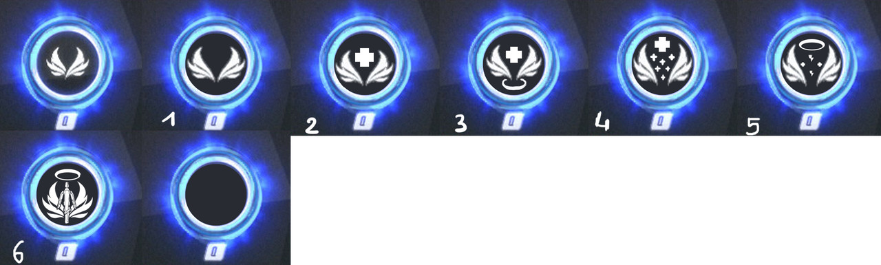
Well, i find that the icon of Valkyrie is pretty “empty”, or it is less “powered” than the other ultimate icons.
So i would like to have a new icon for Valkyrie.
I’m not an artist, but i did some of change to the icon to make it “fuller”.
https://s18.postimg.cc/qw3j7gsmh/icona_valkyrie.jpg
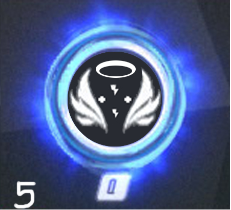
(with the number 5 included : https://s17.postimg.cc/3uxp747bz/icona_valkyrie222.jpg )
(with the number 6 included:
https://s17.postimg.cc/nzvuqf5zz/icona_valkyrie6.jpg )
(with the number 7 included:
https://s31.postimg.cc/47qxkf3y3/iconavalkyrie7.jpg )
(with the number 8 included:
https://s7.postimg.cc/4q02vakmz/valkyrie8.jpg )
The first in the image is the original, the other the changes i made.
The idea was to make the icon that describe both flying and healing.
Sorry for the bad quality but also with a screenshot from the game, it is pretty low res when zoom.
Free to discuss (if you like the original one or some of mine, or if you have suggestions too!)
Thank you!
Edit: Thank to ImAMistake for the image in the thread!
https://s17.postimg.cc/3uxp747bz/icona_valkyrie222.jpg
This is a number 5. Thank you for your feedbacks
Edit: Added number 6 from an idea by iamcatbug
https://s17.postimg.cc/nzvuqf5zz/icona_valkyrie6.jpg
Added number 7 and 8
Another interesting thread about QoL: https://us.forums.blizzard.com/en/overwatch/t/mercy-qol-bug-fixes-and-other-welcome-improvements/89274?u=otamega-2461
15 Likes
The first image is the actual official valk symbol? Yikes. It’s interesting how the icon is just as uninteresting as valk is as an ultimate. 
I really like the far right one.
11 Likes
Thb, I don’t even think they look like wings, the way they overlap looks kinda strange. Like most things about Mercy it feels like a placeholder…
2 Likes
Yes, it is.
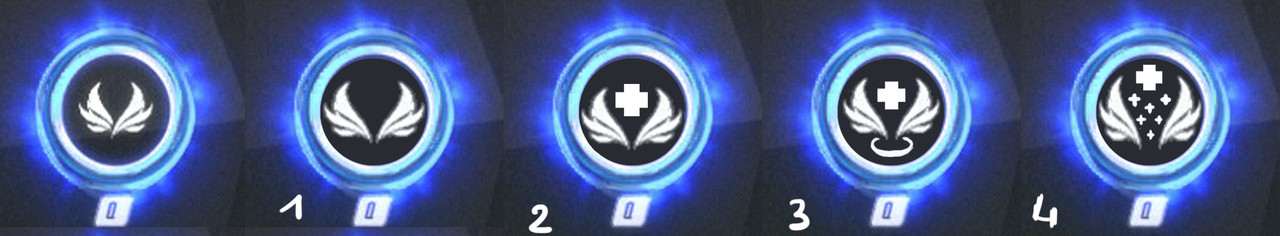
Mine are those with number (1,2,3,4).
Thank you for your feedback!
I don’t know, maybe they are. But at least we could make them better since it seems to be permanent.
If it wasn’t clear I was referring to the current icon, not your designs. 
2 Likes
Yes yes, i understood, no problems! In fact anyway i tried to make it better also if it could be a placeholder 
I love number 3, really emphasizes the angelic design of Mercy
3 Likes
OP’s linked image
They look cool though. Would like to have one of them instead of what we have now.
3 Likes
I like all of them except the original, but the 3rd is my favorite. I would be happy if any of them were added.
2 Likes
I tried to make something about it. This is the better that i thought about your idea. I’ll add this to the main post. Thank you!
https://s17.postimg.cc/58pc2s99r/valkyrie5.jpg
1 Like
Looks quite nice and nice editing!
2 Likes
nice work 
1 Like
I think a halo and a mini icon of her staff added to the original would look super cool! And I really like the #5 design in the thread! And #3 in the original image!
1 Like
Added the 6 icon.
I tried like your idea.
This time i found better quality from the ability’s symbol from the Overwatch wiki. Why i didn’t think before XD?
I’ll add this on the main post
https://s17.postimg.cc/nzvuqf5zz/icona_valkyrie6.jpg
2 Likes
OMG! The number 6 is AMAZING! I WANT IT NOW!

3 Likes
Me and a friend like the 7th one, because that’s what Valkyrie does - nothing :).
This one is definitely the best one: http://prntscr.com/ja4ign
For real though, #6 and #3 look awesome.
1 Like
I don’t hate the original Valkyrie symbol in game but these others are definitely great designs!
1 Like
Just to know. I can quote your image posted in some way? I mean, if i’m not level 3, i can’t ever quote the image for the main post?
Anyway thank for your feedback
 and
and  in place of the small