Alright, i’m bored so i need to know other people’s opinions of arbitrary things.
Backgrounds… the main screen. The maps in the background. The background maps. For the main menu. The main menu background maps.
Let’s talk about which is the best, and which is the worst.
(Excluding the obvious white background of death)
It can be an event background, it can be a normal background..
What’s your favorite?
What’s the bane of your existence?
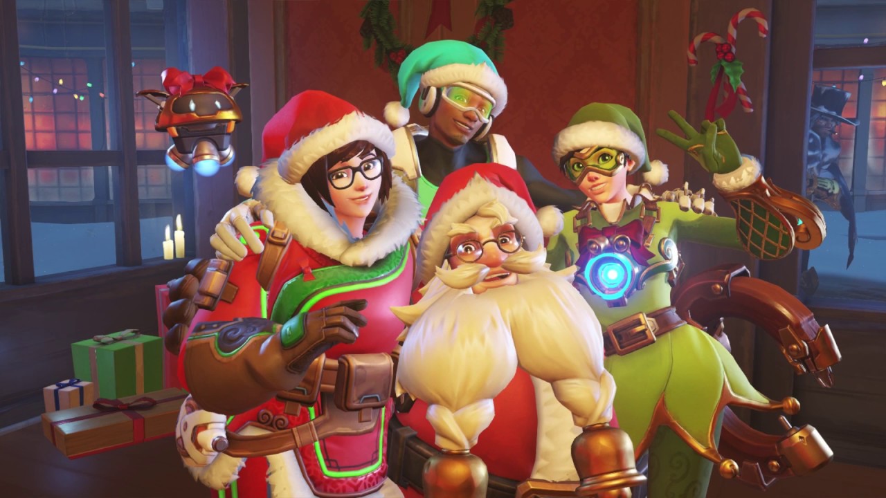
Personally, my favorite has always been the Winter Wonderland event screens:
https://cdn.gamer-network.net/2017/usgamer/overwatch-ana-new-skin.jpeg
/cdn.vox-cdn.com/uploads/chorus_image/image/57956113/OVR_WinterWonderland2017_004.0.png)
(Wow Chibi, how topical and on the point with the event coming up =.= I like them much more than the basic ones, they tend to tell a story more than anything, which is adorable. The second one also took place on one of my favorite maps in the game.)
Now.. which do i hate?
Volskaya Industries.
Having that map on the main screen makes me feel weird.
I can’t exactly explain it, but something about the dull colors makes me feel odd about looking at the main screen.