Clearer and brighter colors that emphasize.
Blizzard said similar things about their about their concept of quality in hiring section.
I go back and forth on the look of D4. I felt like the early reveal trailer was the best it had looked and sometimes still looks great, but certain areas/enemies/spells/affects looks off in their color and animations.
D2 is king for me, but I recognize the strengths of D4 and hope it takes the cake. With that said, D2R might be the best looking yet, including D4. I will have to wait and play both of them though before I can pass judgement. D3 is dead last, and that is including D1.
1 Like
I rate D3 pretty highly for its use of color, and display of effects on-screen. I’m fairly impressed with it on a technical level. Some incredibly talented artists did great work here.
D4 I straight up do not like. It’s like they took a 180 from D3 for the wrong reasons and gave us something that’s just bleak for the sake of being bleak. Color isn’t a bad thing.
D2R has amazing visuals as well. I’m looking forward to the final product.
3 Likes
You only like D2 obviously.
1 Like
Yes. Color isn’t bad. IF one game is dark because the technology wasn’t able to keep up with the creators imagination, it doesn’t make the game good or bad. And the opposite is also true the other way around too. But with D3, I think the creators were able to create what they wanted to create. The art and stuff is exactly as the creators want it to be.
With new technology they were able to more accurately go back to D2 and touch it up and make it more representative of what the creators intended but wasn’t possible at the time.
1 Like
Things move on. Some can’t accept it, some can. The fact Diablo is moving on to D4 some can and can’t accept it. Blizzard totally agrees. Why do you think they put D;I and D2R first?
2 Likes
Is that a reply to me? I don’t think I’ve ever made a claim to be a D2 fan. It was awesome for its time, but it’s downright ancient in a bad way by today’s standards. The music and atmosphere hold up, but that’s about it. I stick to D3 because it’s a better game by nearly every measure.
D2R seems to be an excellent touch-up and there’s nothing wrong with acknowledging that.
2 Likes
Because one was already in the pipeline and the other was a minimal investment of time for a reasonable return. Diablo 4 is still a ways off and would have been no matter what they released in the interim.
3 Likes
Not that I want to complain but it looks more like some Fantasy Apocalypse instead of Hell.
Photmode could be one way to bring “Diablo” to alive. Players can take photos and make them as they wish, to make own Diablo exprience.
I don’t let “color” dictate whether I should like the game or not.
The gameplay is what mattered to me.
Currently my personal favorite is the original D2, and the only thing I do prefer more is an upscaled version of D2:

I personally was also disappointed with the D2 Remaster. It looks and feels more like someone put D2 as a mod into another game.
The D2 Remaster is also much more bright in regards that it looks at certain points that the particles in the air are glowing and certain spell and particle effects (like fire and explosions) are really, really bright, while in the original D2 they were much more matte.
I respect that some people like D3’s use of color, but for me it was too much, especially the bright neon colors on spells and elites and also the lack of darkness.
I very much would have preferred something like this (modified)…

over this (original):

… or this here (modified, but probably should be even darker):

…over this (original)

What D3 could have been (in my mind) is surpassing what D2 was.
Well, I have standards.
1 Like
Don’t push your “standard” on others. ![]()
1 Like
D2, w/o a doubt, no rosetint, actually thought about it and agree with d2’s way.
this is a required add on post for all the d3 minded ppl who label on here.
D4’s looks the worst bc grey/faded isn’t good looking, and it’s obvious this is what D4’s devs think ‘made d2 great’ was ‘dark’ which they translated to ‘greyscale colors’.
D3 and D2R are so neon beer sign, it’s awful.
D4 is so sandy beach desert, or bankrupt artist who can’t afford contrast.
D2 had color, the right kind. the problem is we don’t know the correct term to call it. Look at idk poison jav its green and contrasts well against the background w/o being a coors light sign and also w/o looking dull.
Its a case of overcorrecting. D3 did it wrong, D4 tried to turn the bolt right and cracked it, that’s exactly what’s going on.
1 Like
Go to this link ==> https://news.blizzard.com/en-us/diablo4/23308274/diablo-iv-quarterly-update-february-2020#Angela
Item Icons (work in progress):
Grainy, grey, drab, dull, ugly, yuk, low light, …
Inventory shot of Druid:
First Impression… Fat Hobo, terrible lighting, ugly 1980s icons with diarrhea colored backgrounds, too much grey and shadow, drab, ugly, lame 2 color icons for the attributes, ugly teal stain leather background for the attributes section
Left-Corner Action Bar shot:
Hells to the NO. Devs, please stop trying to homogenize (aka dumb-down) the game to support consoles. I don’t play games on a couch 8 to 15 feet away from a 40 inch flat screen. This left-corner crap is going to be terrible eye-strain. The near constant left/right pull of the eyeball is not smart. Oh wait. I play on a PC with a keyboard and a mouse. Make 2 UIs. One for PC with action bar at bottom-middle and do what ever you are going to do for consoles.
The icons on the action bar are drawn in the stained glass manner and they are in the drab two-toned design. Why are they dumbing down the graphics?? This looks and feels like Windows 10 where M$ dumbed down the graphics for tablets. Windows 10 is already vomit worthy. Don’t follow M$. I spent $$$ on good PC equipment so that it can keep up with rendering beautiful imagery in and out of games. The icons are meant for low graphics setups so, why would I spend money on this product.
The Wizard’s tattered cape, and the colors of her armor = ugly hobo motif.
Supporting Controller on PC:
The skills UI is designed to be manipulated by a controller. I’m for players being able to use a controller while on PC, but when the UI is heavily dumbed-down just to support controller then I’m not for it. Even the small animation shows the drastically scaled down UI. Strip it down to the bare essentials to allow for controller manipulation. As more controller manipulation influences the design of the game and UI, the closer you get to a game that is designed for console. There is a reason why I don’t have a console and dislike console games.
16:9… This is the ratio by which the majority of PC flat panel displays (and flat panel TVs) run on. Imagine someone has a 40 inch flat panel (I don’t wish this upon them). They have to drag, with a mouse, left to right to alter their action bar. Devs, are you trying to make it more difficult/less convenient to use a keyboard and mouse?! Leave the action bar at the bottom-middle. Make 2 UIs. One for PC and the other for console. Design the PC UI for mouse and keyboard with only VERY MINOR allowances for controller support. Do what ever you do with consoles. Don’t homogenize. D3 did it right with drag and drop between action bar slots and select runes. Don’t drag runes/spells to slots. Don’t try to be cute and edgy for the sake of being cute and edgy.
Couch Co-Op UI:
Leave that crap to the console UI. On a PC your display is not shared. There is a reason for network adapters and network communication. Hey Acti-Blizzion we aren’t in the 1980s anymore. We can afford to have our own displays and our own PCs. My son has had his own PC since he was in the 4th grade. A custom built PC with a real graphics card. I currently have a 24 inch flat panel. He currently has a 30 inch curved panel. Even while on campus he and his friends had multiple consoles in use along with their desktops and laptops. Very little couch co-op play. However, I’m fine with it being in the console version of the game with the console UI.
I’ve already commented on the art style being dull, two-toned, ugly, stained-glass, washed out water colored, etc. The same would go for the Talent page in the couch co-op shot with it grey-scale background image.
Monster Family short Youtube video:
A 360 degree still shot, panned left to right, with limited gore is not worthy of needing a login to view. I can streamer uploads of D3 without login. Don’t make me log in for that. As for the monster family directly, it looks like the D4 team was trying to draw too heavily on Mad Max. The majority of the 10-17 year olds most likely have to go Google search to understand my reference. The question will be but is it bad or good. You are going to get a look that says I’m unimpressed. You could have and should have done better, but I’ll let this go for now.
The cultists shot:
Its not in the game. It looks like a shot from a cinematic.
The Cannibals concept art shot:
Brown, beige, a little read and rust. Very simple hobo design. Why Hobo? Cheap stained cloth or leather boots and leggings with straps to hold them to the body, while having a skirt or skirt with an animal skull, bare chested with a helmet, and other minor cloth or leather armaments. Why would the skirts have buckles attached to them? They don’t look like cannibals. They look like a bunch of broke barbs. By the way when I say stained, I’m talking about how a tanner would stain a piece of leather to give it color or how one would use a stain on a slide in chemistry, stained-glass windows, or other water color staining.
My critique is limited. Even watching the game played by another person is limiting. Give me access to the game for a week. I’ll be able to give feed back about what’s good, bad, what works and what irks, and why.
It is pretty clear - reading through this thread - that this isn’t my intent.
D4 - unlike D3 - is also about (various shades of) psychological darkness, and they definitely succeeded with that, as D4’s vibe & tone is not just about horror, but also about depression.
They might have succeeded with that a bit too much, though, at least for me as I wanna play a “dark gothic ARPG horror game”, not a “grey, post-apocalyptic, bronze-age ARPG depression game”, if that analogy makes sense.
Yeah, I agree with that.
It basically is like that D4 is trying to overcompensate for what D3 did wrong in that regards.
Ah, now I see what you mean.
I have not realized until now that a stained glass look for the skill icons was what they were aiming for. I thought and hoped they were placeholders and I kinda was confused by their design.
I noticed this as well. The grey, the desaturated colors, the lack of blackness… it is everywhere, even on the clothes that the characters were.
Combined it all looks unnatural, like a painting with washed out colors… and that is what they were aiming for as their artsytle. It certainly conveys the depression of that time, but that is not a “painting” (so to speak) I would want to hang into my room.
Everything is grey in D4, not just the characters, but also everything else apparently… which might not be the best design choice imo.
It is probably because D4 plays in a post-apocalyptic, kinda bronze-age setting, and not a medieval gothic setting like D1 and D2 and RoS.
The Black Soulstone killed ~90% of the population.
I keep hearing players refer to D2/LoD as “dark”. What do you guys means by this? Do mean dark as in low light? Like, in the Cathedral in D2 where it literally is a very low light environment? If that is the case then I am NOT in favor of that. I will keep my eyesight thank you and no I don’t want to roll light radius on my gear.
Where is this mentioned? Last I remember was that Malthael did not succeed in setting off his apocalyptic plan with the black soulstone. The nephalem defeated him otherwise they would have been wiped out with the rest of humanity. Am I correct?
This is from a cultural perspective; a euro-centric cultural perspective. It doesn’t translate to every other culture. This is the same as people in the US assuming that everyone would use the color red to represent danger (or passion). Not everyone is depressed by the various shades of grey or is calmed in an enclosed space that is all white (psych wards and straight jackets). Too much cultural bias can have a negative effect.
The weapons the “Cannibals” hold are rusted not bronze. This would put them in the iron age.
I don’t agree with this. However, this comment leads me to think that he refers to dark as low light and thus he is most likely referring to the low light horror environment of the Cathedral in D2 or the low light environments of the tombs in D2 Act-2. The low light environments is one of the things I really dislike about D2. Clever use of shadows can be done but when 75-80% of the screen/environment is placed in shadow it will have negative effects on one’s eyes.
Part of why I hate Act-3 town is because of its horrible low light design. Magic is intertwined in the story of Diablo so there is no point in having very low light environments. A wizard can cast a blizzard in-doors, can shoot electricity, cast fireballs, summon meteors, but simple self-sustaining light sources aren’t doable? Unfortunately, you can’t hear me laughing as I walk from the keyboard to the kitchen for a drink of water.
I will say for sure that D4 should not have a whimsyhire or whymsydale, no rainbow land or rainbow goblins, unicorns, cuddly murderous teddy bears, and cutesy killer flowers. Hells to the NO. Murderous moo-moo cows don’t make sense either.
D3 is bright and relatively easy on the eyes. The armors are polished art (we’ll leave the witch doctor out of the discussion). Polished as in high quality with good saturation. Whymsydale/shire and the creatures within them don’t belong. A bloody gore laden game is not what you introduce to a 5 to 8 year old. Adding teddy bears doesn’t suddenly make it age appropriate for that group.
Those are some detail crafted stained glass placeholders. Also, the devs never said explicitly that the icon art for skills were placeholders. They are cute, edgy, and out of place like whimsyshire. Creating stained glass windows is a very complicated and technical process. So we are to believe we are in a post apocalyptic, iron-age to medieval environment, with magic, and stained-glass, and the best humanoids could use to cloth themselves would be drab brown cloth/leather hobo attire? Is the dev team, art team, and management that lazy? Unimaginative?
When the devs released the rogue game play announcement trailer we see that they have kept the stained glass skill icons. The armor of the rogue ranger has red in it. However, the sorceress game play videos show her with drab brown and this is also shown in the campfire character selection screen. Stained glass icons in the sorceress gameplay as well. By the way, I hate that lightning whisp/spark attack. D2 did it right.
Also, in the rogue range gameplay video some of her arrow attacks have a gun firing sound effect. More that is out of place.
Oh and the videos:
Rogue => https://www.youtube.com/watch?v=rSDIzMid6Lc
Sorc => https://www.youtube.com/watch?v=9FK923_Wjbg
i calibrate every game i play through my GPU drivers(AMD here).
and as im green color blind my screen shots wont have any use for you bro.
i see…and i agree.
me too, i got really in to soft modding d2 and i still have my 1.13c fully modded installed.
i also modded alot of Monster Hunter World and i have a work in progress yu-gi-oh forbidden memories modded version that i play on my phone when im not at home.
i agree so much with this…but i think it can still be if SP modding was “legal” or the maintenace team could spread some wings.
scalable UI is a must for today.
here in Brazil most catholic churchs have that gothic style and most of us here have visited some of those churchs while growing up with grandparents/parents, so i really like that stained glass look cuz its just a punch from my childhood.
same for d2 for me, as i live in a city on the margin of the biggest river on the planet, in the middle of the Amazon florest, act 3 and Kurast is just too familiar and special to me, especially its endless night, Only those who have already traveled by boat here or in any tropical jungle knows what is to always have something lurking around in the dark.
I buy d4 medieval/gray washed/stained glass style becuz, from my sight, its well done.
1 Like
To be fair, it’s also not your first attempt at the subject where you’ve shilled altered photos trying to push your preference. And as I’ve frequently called in similar topics from yourself or others in the past, what we wind up with is a bunch of people who actually don’t have a deep understanding of the mechanics behind art, let alone a specific style, at best barfing out criticisms that something is too saturated or not dark enough when colors do exist in reality beyond earth tones.
It’s further likely many of these same people are also approaching the topic from the mindset that D3 and anything it has done is trash, so it’s not difficult to detect a seething bias. Claiming you don’t mean it otherwise doesn’t mean it isn’t there, and tossing out edited versions of D2 box art strikes me as a prime example of the pettiness manifesting as they’re not even gameplay at all and just cherrypicking. A distinct lack of D2 edits also reflects bias, but I’m willing to give the benefit of the doubt here because just toggling some sliders in Photoshop can’t adequately reflect what the game needed to visually improve from it’s own cartoonish 800x600 roots.
Personally, I’m going to keep my critique of D4’s look minimal given it’s still in production and thus subject to change and polish, but right now, I’m still getting uncanny valley vibes from both character models and the environment. Too dark, too light, not enough colors, too many, or whatever doesn’t matter to me when things look irksomely fake. This was also a problem I had with PoE, especially with the character models, where it just felt like they stopped a few steps into the design process and decided to pass it off as their style.
2 Likes
I definitely don’t see them trying to push anything to anyone, they’re just stating their opinion. I think you’re criticizing unnecessarily.
Wait… we, mere mortals, who don’t understand color theory, cannot express our dislike over the use of colors that don’t don’t please our sensibilities? How dare we?
You don’t know the people that are posting on this thread and don’t even care to research their profiles before spewing this nonsense. Actually, it’s as if you didn’t even read the entire thread.
@clueso doesn’t need to be defended, since most of their posts are rich, insightful and speak for themselves. But I feel the urge to point this to you, since you seem to be a bit clueless.
2 Likes
It is both the color scheme / lighting as well as the psychological darkness.
D3 was flimsy and silly at times, with a lot of corny jokes and comic relief (which also was in D2, but more in optional conversations, while in D3, it is a bit more “in your face”) and the colors and the lightning are more bright.
In one of the D4 panels from the 2019 Blizzcon, probably the story & lore panel.
I had to search for the particular timestemp, but I am sure others can confirm.
The Gothic Period was part of the medieval time period, which was more advanced than the bronze or iron age, which in a way where more primal and a bit closer to the stone age than the Gothic time.
D4’s setting is definitely pre-medieval, that is my point.
I was a few times in Brazil when I spend a few weeks with a shaman in the jungle and drank Ayahuasca, but I did not visit these churches you mentioned, but I assume that they are in a way similar to the ones we have here in Germany, with the most famous one being the Cologne Cathedral:
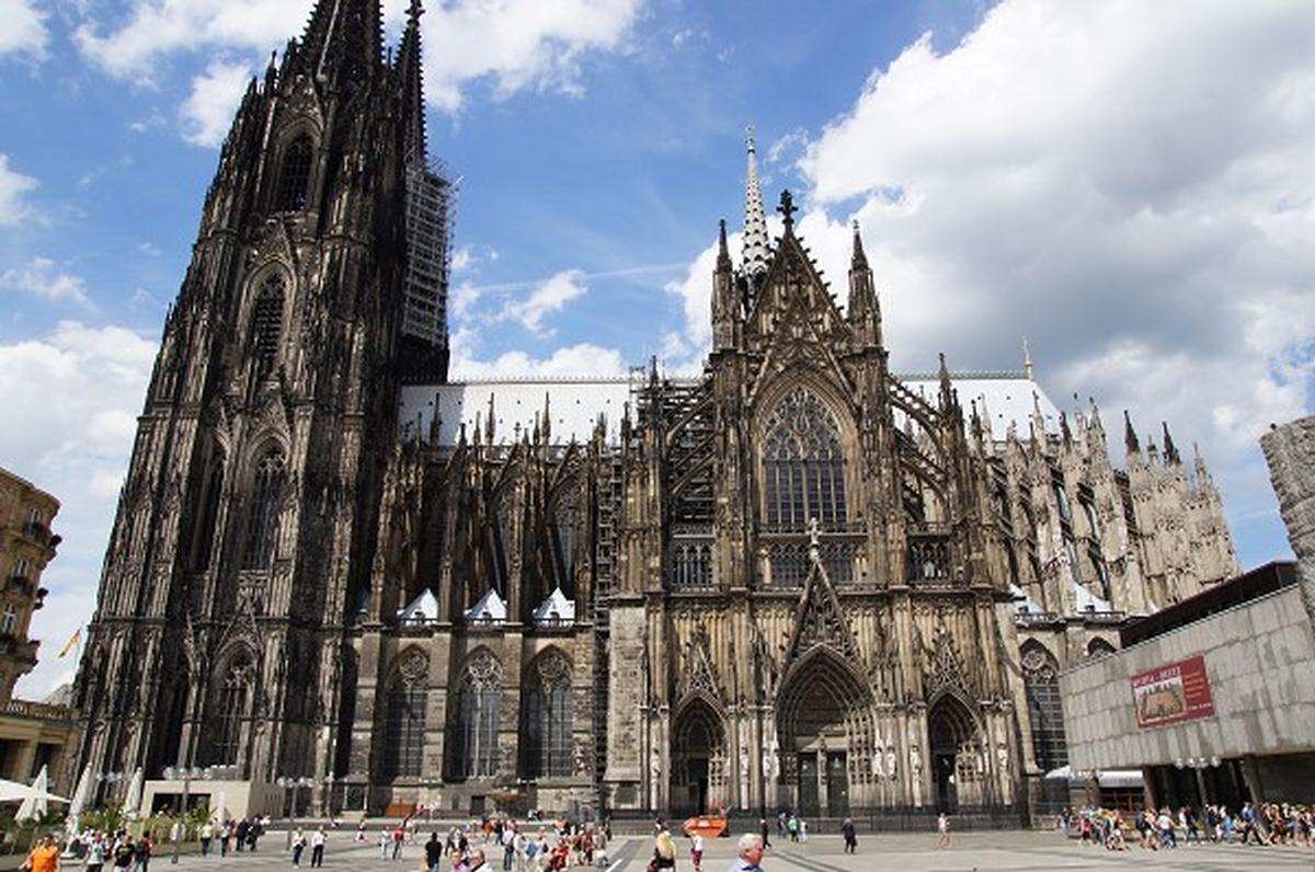
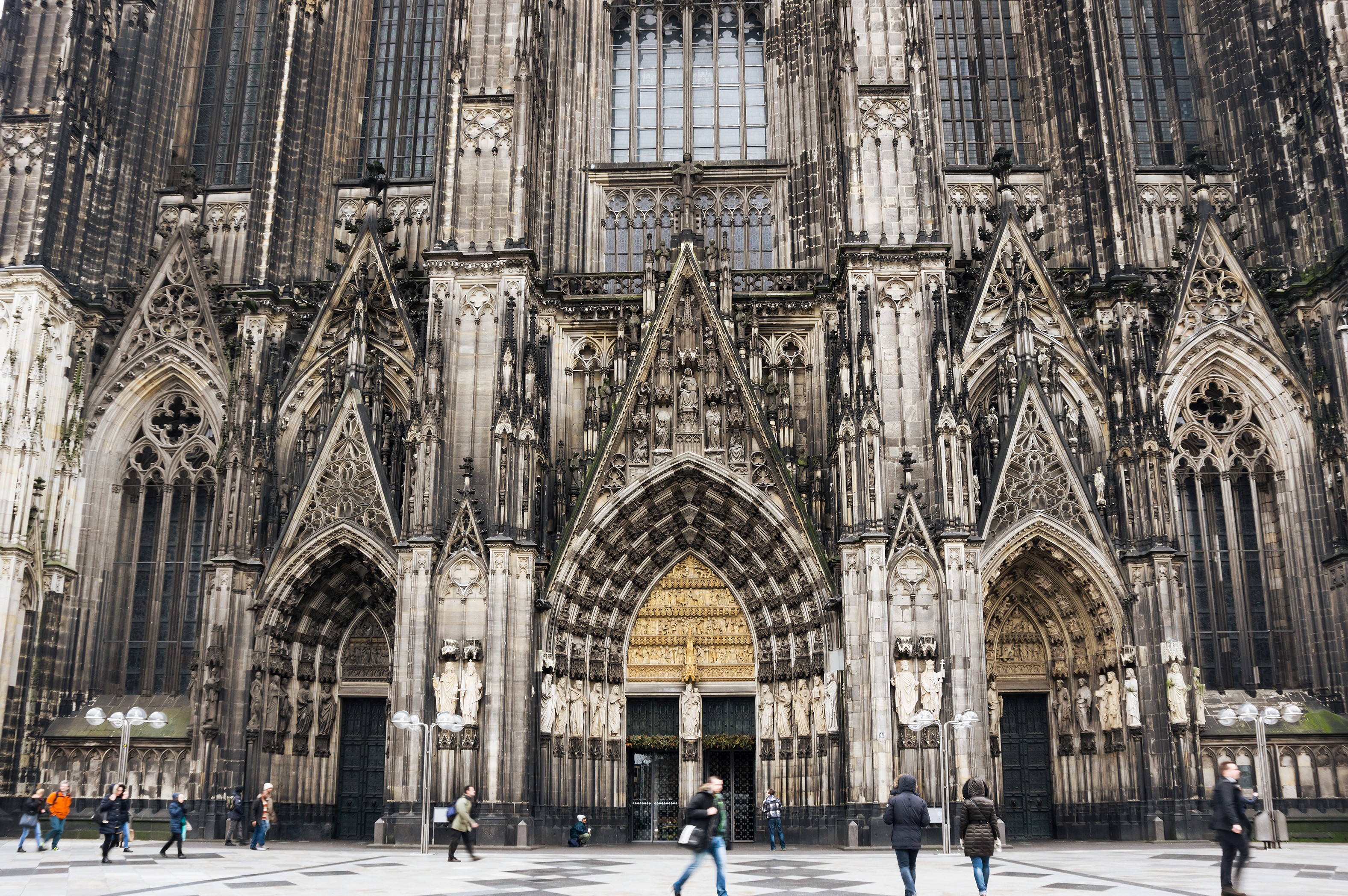
The Gothic Artstyle is very very spiky as opposed to the Renaissance Style, which has much more curves.
It is not really a push, but rather a more lighthearted talk and approach.
This here is more a talk and a sharing of various personal preferences of various individuals that (hopefully) come together in mutual respect for each other.
If it leads to a change in regards to an artstyle that I prefer, fine, if it doesn’t, than its also okay even if I would disagree with it and not like it. A push would would be more agressive.
I always had the opinion that D3 did certain things better than D2 and D2 did others better.
I actually kinda like the painterly artstyle of D3, though I would have preferred some alteration in regards to the color scheme and the lighting
Of course I am biased towards D2’s style. How could anyone of us not be biased towards what kind of art we like and what not? The point is that this here is not an aggressive push.
Yes, that is also how I perceive this whole thing here: a sharing and an exchange of personal opinion and preferences.
I and other often emphasize that in regards to things like these, it boils down to personal preferences, and we all get along with each other, and one reason for that is that we don’t push things on each other or try to explain to others why they are wrong for liking / preferring something else.
2 Likes