How do we fix D4 color schemes?

I hate d4’s color scheme. It’s too gray and unvaried. I know what you’re thinking “I don’t want any my little pony D3 Bs!”

And that’s exactly what i want to address and hope the community will comment on.

D2’s pallete wasn’t unvaried or monochromatic at all. Act 2 in D2 was arguably brighter colors outside the city than Act2 in D3. Act 5 in D2 is actually brighter to some extent than D3’s similar zones, especially when we’re talking about outdoor zones. I believe there’s lots of examples where the gold standard in coloring (D2) was actually more varied or at least as varied as D3.

So there’s 2 questions i want the community to discuss to help drive the direction of D4:

What color scheme do you want in D4?
What made D2’s instances of brighter color feel “darker” than D3?

As an interesting side note, i’m in the torchlight frontiers alpha and something i realized was that the different frontiers give them the ability to have a varied color scheme in what’s supposed to be an apocalyptic arpg. The hyvid frontier feels oppressive despite being inundated with bright green, and i really like that there’s both varied color and theme while not losing the feel of the oppressive atmosphere. It’s not anything diablo level, but i appreciate it because i don’t want to play something that’s all 1 color.

Edit: to answer my own questions, i want variation in lighting and color, even if they still feel oppressive. Frozen tundra or desert on a sunny day can still feel dangerous and oppressive, despite being bright. I don’t know the answer to the D2 lighting questions, hence why i’m asking.
3 Likes

They told their idea was to create a tonalistic game and I personally love that direction.

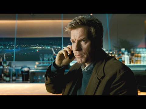
For example you can go watch a film like “The Ghost Writer” which is an example for such tonalism style and then compare its art direction with some more colorful film like “Avatar” for example.

Diablo 4 is supposed to have a large open world that takes us to many places, which means that the colour scheme and lighting should vary quite a bit from land to land.

A desert should be bright in the middle of the day and give us the feeling of a hot sun beating down on us, just as the areas around Tristram should be dark moors and caves and give us more of a traditional Diablo 1 feel.

I wouldn’t say it’s all 1 colour but in most of the gameplay footage I’ve seen it feels like the saturation of the colours in the environment needs to be turned up a bit. A dark and grim atmosphere doesn’t mean that the colours need to look washed out and dull.

Even in the gameplay trailer where it shows somebody riding a horse through a desert, the colours look rather dull for what a desert ought to look like.

3 Likes

at least wait for game release to hate it

2 Likes

Well i am not an actual fan of the “horror and dark” thing, i just want it realistic
So i would appreciate some colors in desert and swamp f.e.

3 Likes

I thought the pallet looked ok. I’ll wait to see on my monitor to really judge it.

Can you link the movie? There’s lots that came up when i searched for ghost writer. Given the open nature if Diablo’s loot, they could afford to do something different in a zone or two.

The answer i can think of that explains the discrepancy between d2 and d3 despite d2 having brighter color instances is the contrast between light and dark. The world never got as dark in d3 as d2. And in some cases your light radius and skills were the only light you had. It might be interesting if they experimented with this again. The world can only feel as dark as darkness’ contrast to light.

1 Like

On the flip side if we wait too long we won’t get anything different because the devs will be sideswiped by it.

Personally I love it.
Perhaps the desert could be a bit brighter but maybe it will be once it’s released and we can see it on our own monitors? :thinking:

Yes, this what some us mean when we mention D2 darkness. It would be nice to have light radius again. It made dungeons/caves more eerie not being able to see what was out of your light radius. It made you go a little slower because you didn’t know what could come out of the dark.
Also D3 just seemed clean. Like no blood, gore or Satanic sysmbols that I can recall. D2 had some blood smears on the ground and walls and bodies with pools of blood and bodies hanging on spears, not a lot but enough.

1 Like

D3 got criticized for being too colorful. Now D4 is getting criticized for being too grey and dull.

Seriously, make up your mind. Which style do you want, bright and colorful or dark and grim?

3 Likes

This is the least of my concerns.
So far it looks like they are on the right track anyway, dark, gloomy, gritty.

Customisation and Itemisation is where we should focus our feedback.

1 Like

Op is right.

This is a discussion between the Art director who decides a certain color palette, and the lighting artist who can locally tweak the atmosphere for each area.

The human eye and photo cameras are very much less sensible to colors in dim light. This is why I agree act1 should look less saturated than act2.

Blizzard was terrified because of blizzcon 2018 that they wanted to be sure “Diablo4 is Darkness, World and Legacy”. The Gameplay video does not pay tribute to the work that has been done imo. Their over-the-shoulder camera scenes look bad. The lighting, textures and scenes are not convincing or too clichés in the beginning of the video:


They probably ran out of time and could not strategise the ideal things to showcase.

Dark is vague term to say “serious artstyle”. But in my opinion diablo is about showing reality. Reality in its simplicity, Reality in its brutality, Reality in its authenticity, Reality without filter. “Dark” or rather seriousness should not only apply to the visuals, but to the story, to the music, to the pace of the game that is currently too fast like d3. In arpg there must be a time for emotions, in addition to analysis/thinking, and adrenalin/action.

Though artstyle can be broken down into:

  • historical immersion / how many layers of fantasy
  • Realism of the FX and CG vs overdone
  • Scale of the monsters, of the textures and of the architecture (scaled up usually look more cartoony)
  • User interface historical artstyle, saturation of the icons ( I think it’s a underestimated topic)

And indeed, we don’t always need desaturation filter to make it look raw. Applying the right lighting can do the job. Though any modern lighting software turn night or dawn images unsaturated, it’s a property of the human eye.

2 Likes

You have to understand that creating the atmosphere of Diablo I and II in 3D is a far different challenge, even with the graphical capabilities of today. So I appreciate their attempt at a “different kind of dark”.

At the end of the 90’s, many games were trying to push the limits of realism within the bounds of 2D video games sprites. One such example is “Oddworld: Abe’s Oddysee”, which incorporated pre-rendered 3D graphics. Allowing high fidelity backgrounds and characters. This creates the dark, realistic and gritty look we are familiar with in Diablo.

When you translate this to HD graphics that render in real time within the game engine, you change the way the game feels in a couple of ways:

You can see more detail:

This goes against immersion and suspension of disbelief. Seeing less leaves more room for your imagination which always seems better. This is not only relating to resolution, but also to frame rates. Kind of like the reaction people had to HFR “The Hobbit” screenings, it makes the image feel staged in a way.

The visuals are not pre-deterimined:

This is relating to things like lighting and animations. In Diablo II all sprites are set and are uneffected by a physical engine. The graphics were handpicked by the designers, so you see what they chose for you to see. For example, the monsters have a “death animation” designed specifically for them. In modern games, this is randomly determined by the physical engine, so you get those puppet like ragdoll death animation that were desgined by an algorithm, and not a human. This comes into play in every aspect of the game.

It’s harder to control for colors and values:

Having a game with limited colors means less decisions. I don’t mean less colors as in “more gray”, I mean literally less possible colors. The designers of modern games come across a decision fatigue when it comes to nailing down the colors and values for their games. limiting colors is a harder task because lighting is effecting everything, bouncing from object to object creating a large spectrum of colors. This was much easier to deal with when times were simple.

So yeah, I think Blizzard is doing a relatively good job with Diablo IV’s graphical side.

1 Like

Color scheme and everything visual is perfect in D4. Don’t touch it.

1 Like

I think the color saturation issue has been exaggerated and what we have seen now is just based on the area of scosglen which supposed to be a lifeless dry hilly grassland. Personally I think the color tone in those dungeons (crypt, garan hold) is alright. Other ares like fractured peaks and kejisthan would be more colorful, just look at the released screenshots.

1 Like

They could also just…not do this.

Granted they’d have to do more work because they’d have to actually create death animations, but it’s not like the game being 3d prevents enemies from having a defined death animation.

The way Diablo 3 did ragdoll deaths looks more silly than anything, which seems like the kind of tone a Diablo game ought to avoid.

This. Dark, grim, unsaturated colors and gore!

You saw basically one area, that was drab overcast and meant to look like that. There are pictures of other areas that have a more saturated palette. However that are going for a renaissance painting vibe for the game. The palette is a bit muted in those paintings. I’m trying to remember that one place with the Blood Bishop. That place looked more saturated as well. I just think it happened to be that location specifically. We are not getting D3 levels of saturation and I don’t think what we saw at Blizzcon was bad, and I love colorful games.

1 Like

This is both right and wrong. You are correct most of my opinion came from the demo, as that’s what i was watching, re watching the gameplay trailer, there is more variety. However gray is being used heavily to cast uncertainty/darkness, even in more colorful zones, so it still is a problem. I fine with sandstorms and fog creating darkness, but that feels like a one trick pony when it’s all the same color.

Also re watching demo footage it was clear there is absolutely not enough saturation in some parts of the starting area. Re watching the boss fight, almost everyone blended in with the area and i could barely make out features in landscape. I’m fine with areas being more gray, but that’s just over the top.